Watercolor Paint-along

I’m still on a John Singer Sargent high!

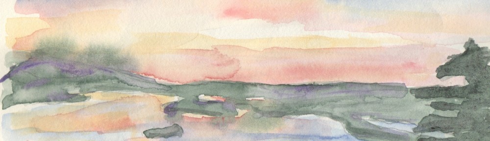
On the MFA website there’s a “Learn Sargent’s Technique” video where an artist, Monika de Vries Gohlke, demonstrates John Singer Sargent’s wet wash technique.  I watched it a few times and this morning decided to paint along.

Have I nailed it?  … not by a long shot!  But it was fun and that’s what matters.

140116jss technique

Last days at the MFA!

Road trip! …words that make my heart sing!

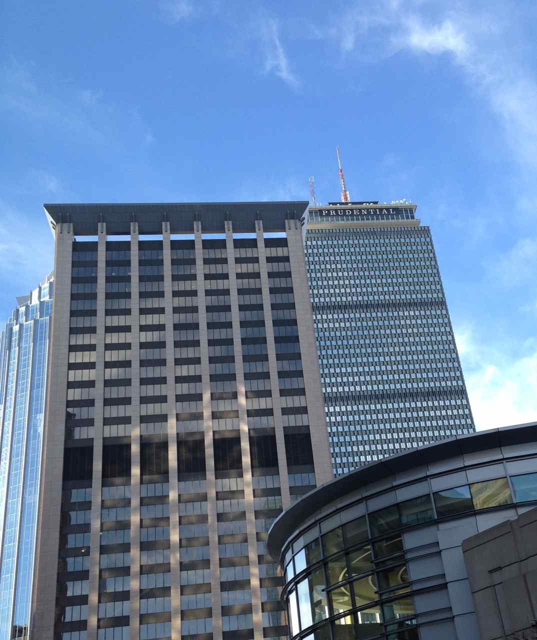
We set off Monday morning on a long awaited excursion to see the John Singer Sargent exhibit at the MFA… Museum of Fine Arts.  And oh what a glorious day it was!   Sunny and warm and no accidents on the highway to slow us down.  We did make a wrong turn but even that surprise didn’t ruin our day.  Google’s map girl to the rescue!  She led us through downtown Boston twisting and turning past plenty of city landmarks.

140113a Prudential

Thank goodness for smartphones with navigation.  She led us directly to the museum.

140113b MFA

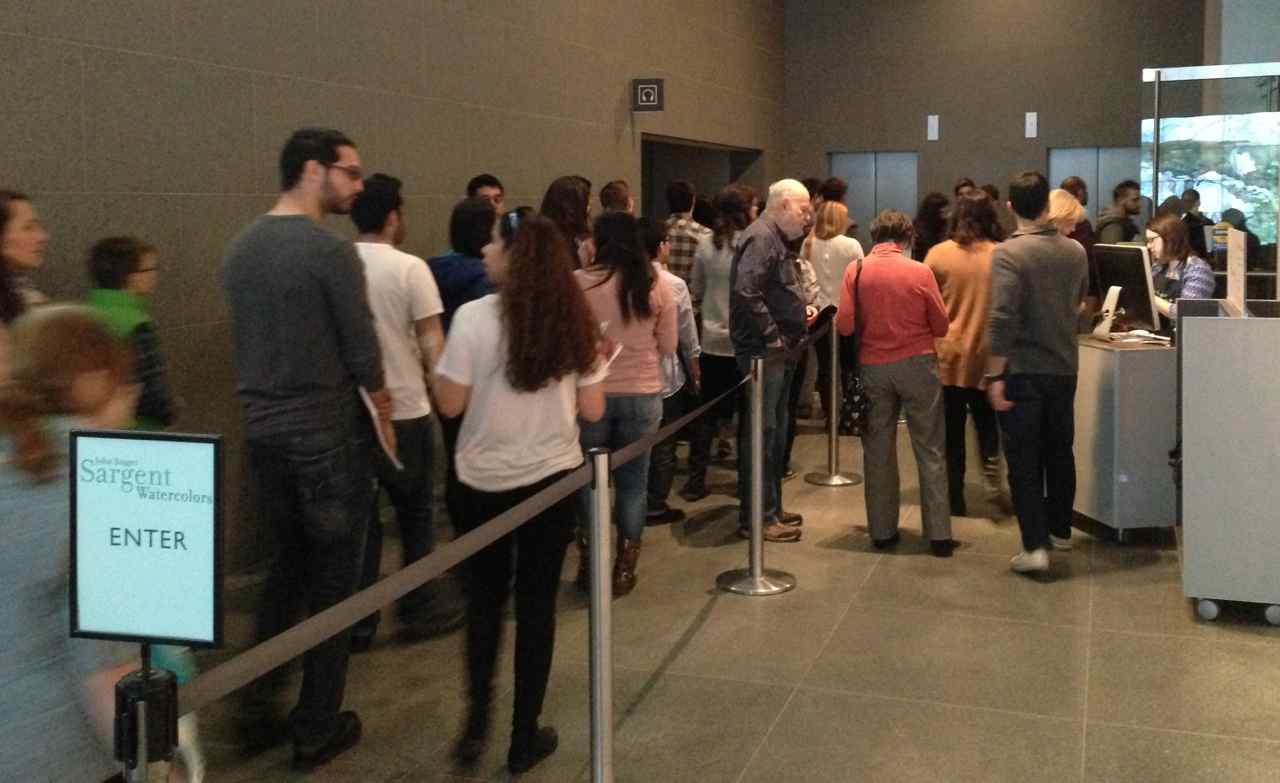
It does my heart good to see how many young people were in line; the gallery was packed!

140113c

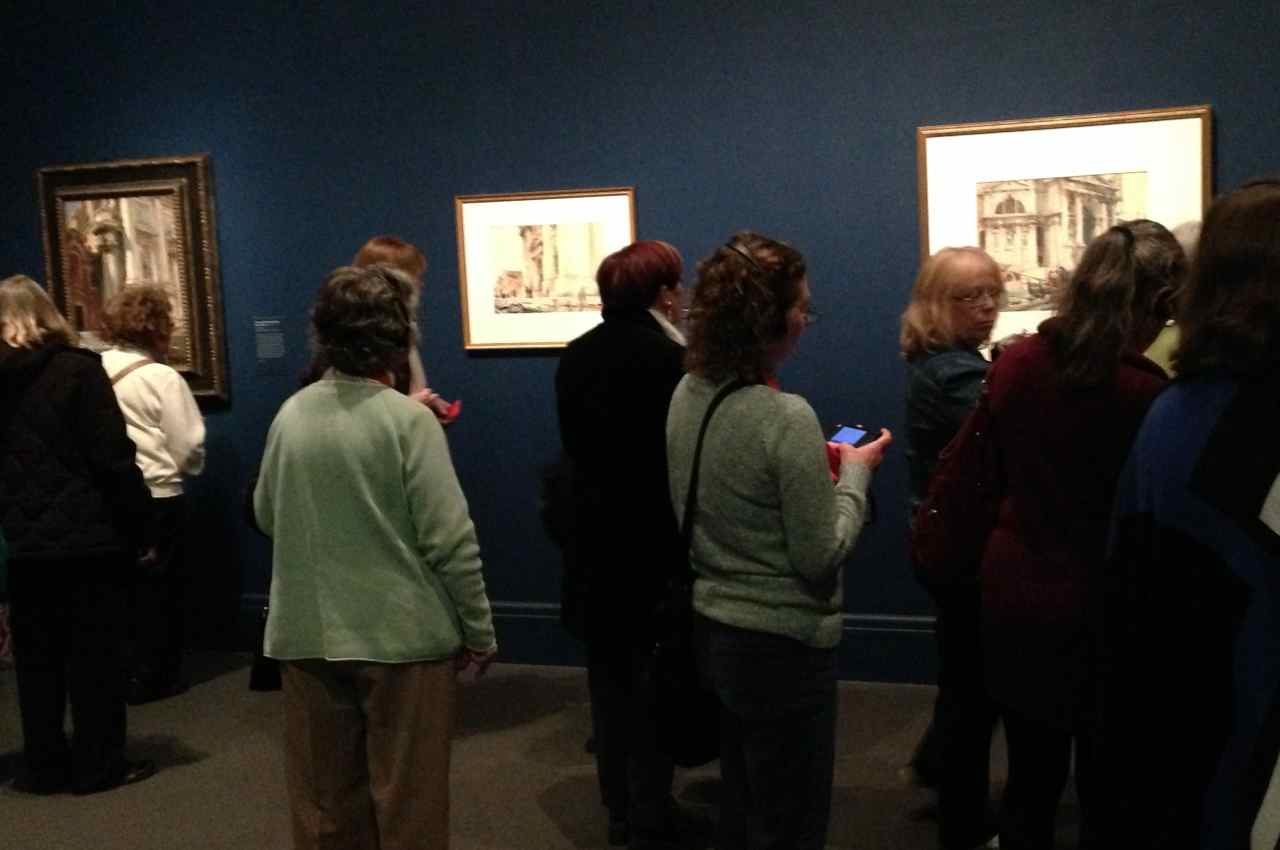
The John Singer Sargent Watercolors exhibit was everything I expected and more.  Almost 100 pieces are exhibited in the Gund Gallery on the lowest level of the Art of the Americas wing.

140113d

Museum rules prevent me from sharing the photos I took of his work but follow the links here to see two of my favorites.  La Biancheria (1910) shows laundry drying in the sun. JSS is masterful as he paints the whites of the shirts and sheets along with the shadows. Boboli (1906) is a painting of a statue in the Boboli Gardens in Florence, Italy.  I was completely taken by his treatment of the shadows on the pedestal.  If you zoom in to see either of these images just imagine me, my eyes just inches from the paper.  I was mesmerized.

I highly recommend a visit but unfortunately, there are only days left to see the exhibit in Boston… it closes Monday January 20th.

Of course, if you prefer, you can always see it in Houston, Texas, March 2 – May 26.  The drive may be a bit longer.  I’m sure Google’s map girl will help you too.

Sketchbook Project 2014 Finished!

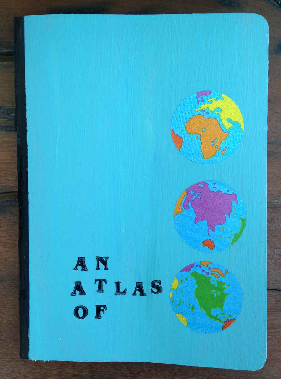
I’ve been absent these last few days as I finished working on my entry for the Sketchbook Project 2014. I felt the need to paint and decorate the covers… make it a real atlas.

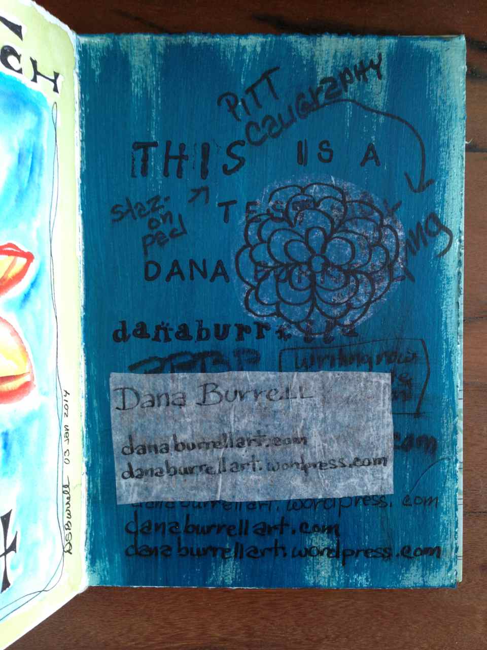
This was my first time using colored gesso and boy. was I surprised how gritty it was! The book just wasn’t pleasant to hold. But how to fix it? I tried many things out on one of my journal pages.  Do I letter directly? Which pen? Should I stamp? Collage?

What a mess!

140109 test page

But now I had a plan! On went the stickers and the stamped lettering, layered between coats of matte medium. StazOn is my friend. It truly is permanent… no smearing as the matte medium was brushed on.

But I still wasn’t happy. The matte medium made the book feel slightly sticky in my hand. Krylon Workable Spray Fixitif to the rescue. A single thin coat was all it needed.  Remember, this stuff can be flammable and toxic, please spray in a well ventilated area.  I did a quick spray outside and then brought it into dry on the stove with the exhaust fan on. After an hour it was completely dry.

SBP Cover

SBP Cover

I’ve had these stickers for years just waiting for the perfect project.

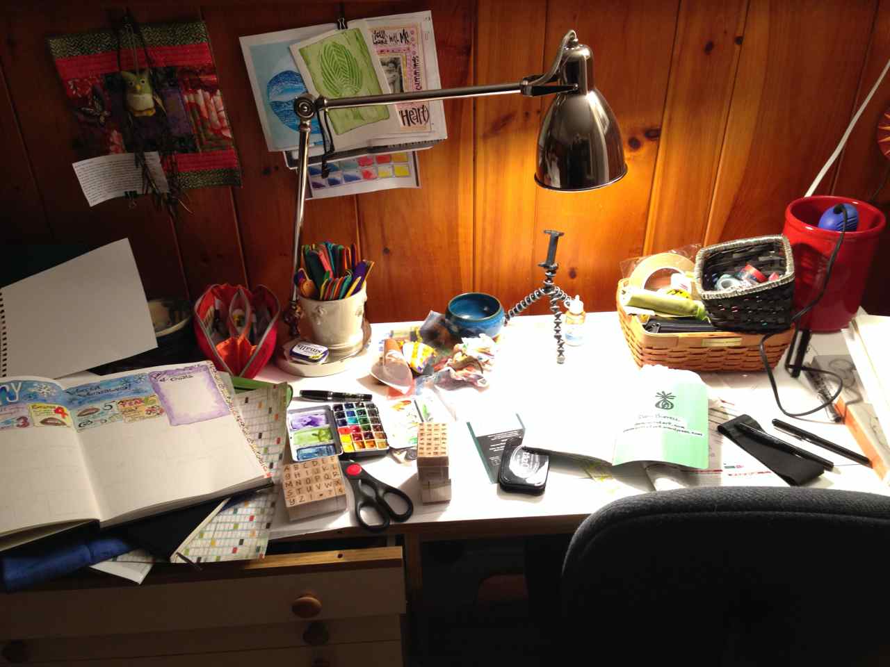
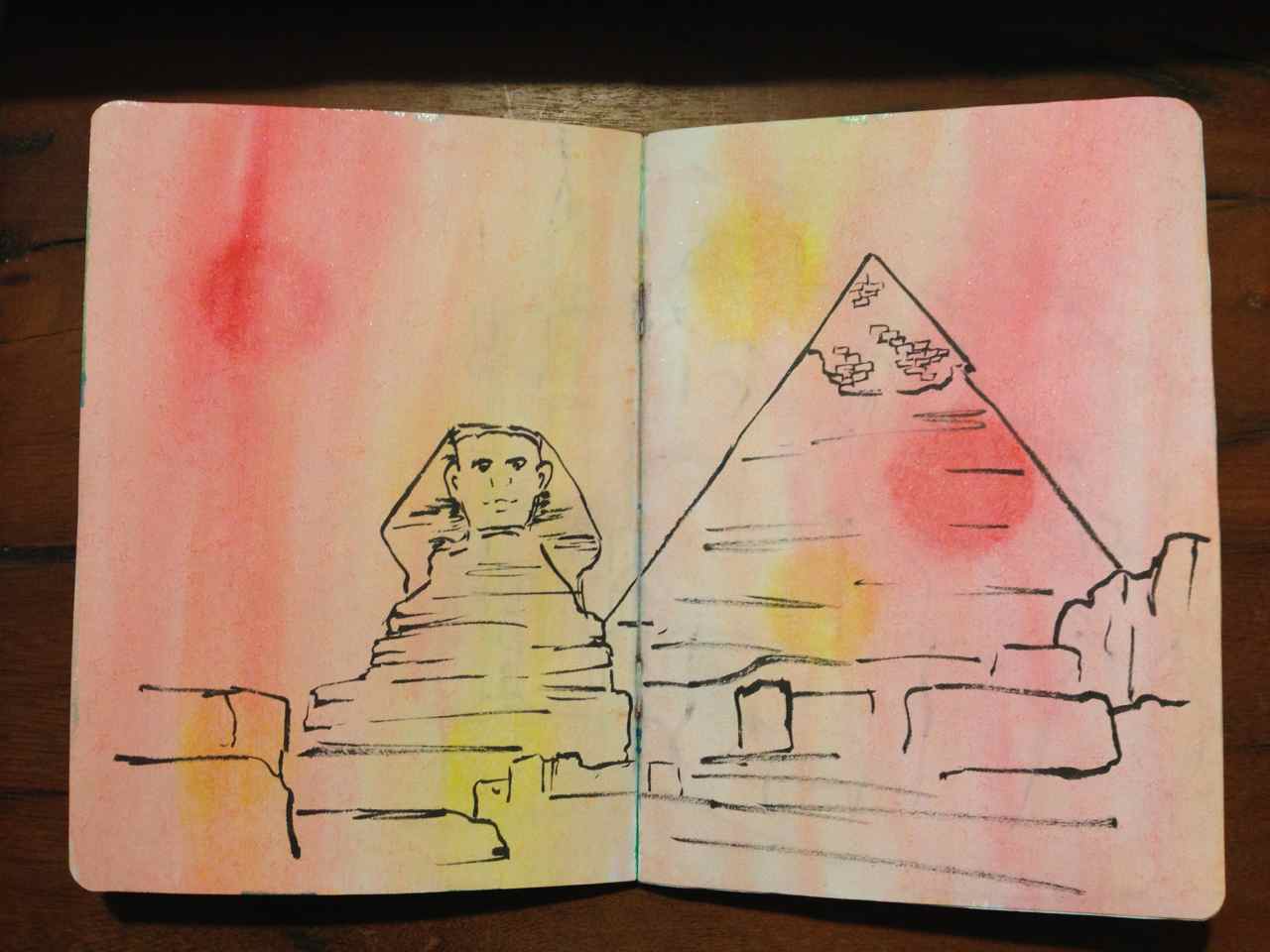
SBP Eiffel TowerSBP SphinxThe workspace isn’t as neat as it was before and that’s a good thing!

140108 studio

I’ve Chosen My Word for 2014

Intentions, not resolutions… that’s what it’s come down to.

Resolutions often focus on the negative, on resolving to fix something wrong, to quit something.  Often these resolutions are broken in under a week.  Sigh… more negativity.

But an intention is positive.  I will… I can!

Each year the blogosphere is buzzing with choosing a word for the year. It’s meant to express an intention for the upcoming year and become a mantra to help each of us stay the course.  In 2012 my word wasn’t a word, it was a phrase. I just couldn’t seem to distill it down to one – single – word.

If not now… when?

It propelled me to participate in the International Fake Journal Month and led me to sign up for book binding classes among other things.  It served me well.

2013 arrived and my word screamed to me!

Simplify!

Out with the old and in with the new. It’s been a year of change and decluttering, so much that I actually feel lighter. My quilting UFOs were weighing me down and all the fabric I was never going to use, a bookcase full, found new homes with my fellow quilt guild members. The decluttering went deep and beyond my studio and extended to divesting myself of family items I thought I’d carry around forever.  Now, a photo, a sketch and the memories of good times are enough.

So 2014 arrived and my word came to me immediately!

Stretch.

This blog is a stretch.  Yes, I’ll upload my artwork but writing about it and sharing a bit of myself?  Oh yeah, it’s a stretch alright.  Baby steps.
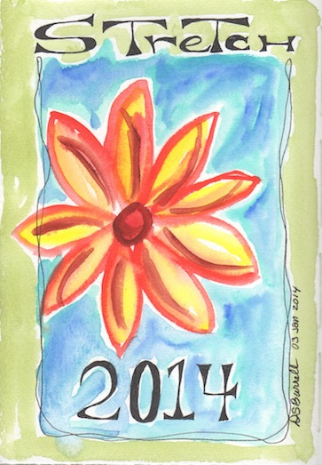
Stretch

This is a year of possibilities for all of us. If having a word intrigues you but you need ideas then please take a look at the words Jane LaFazio accumulated.  Maybe one of those words will speak to you.

What’s your word for 2014?
Sketchbook Project Update!

All the holiday hoopla really cut into my sketching time and now the deadline looms. Wednesday, January 15th, 2014. There’s still lots to do on my project but things are… as they say… progressing.  Whoever “they” are.

Atlas of…  that’s my theme.

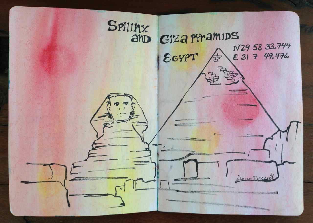
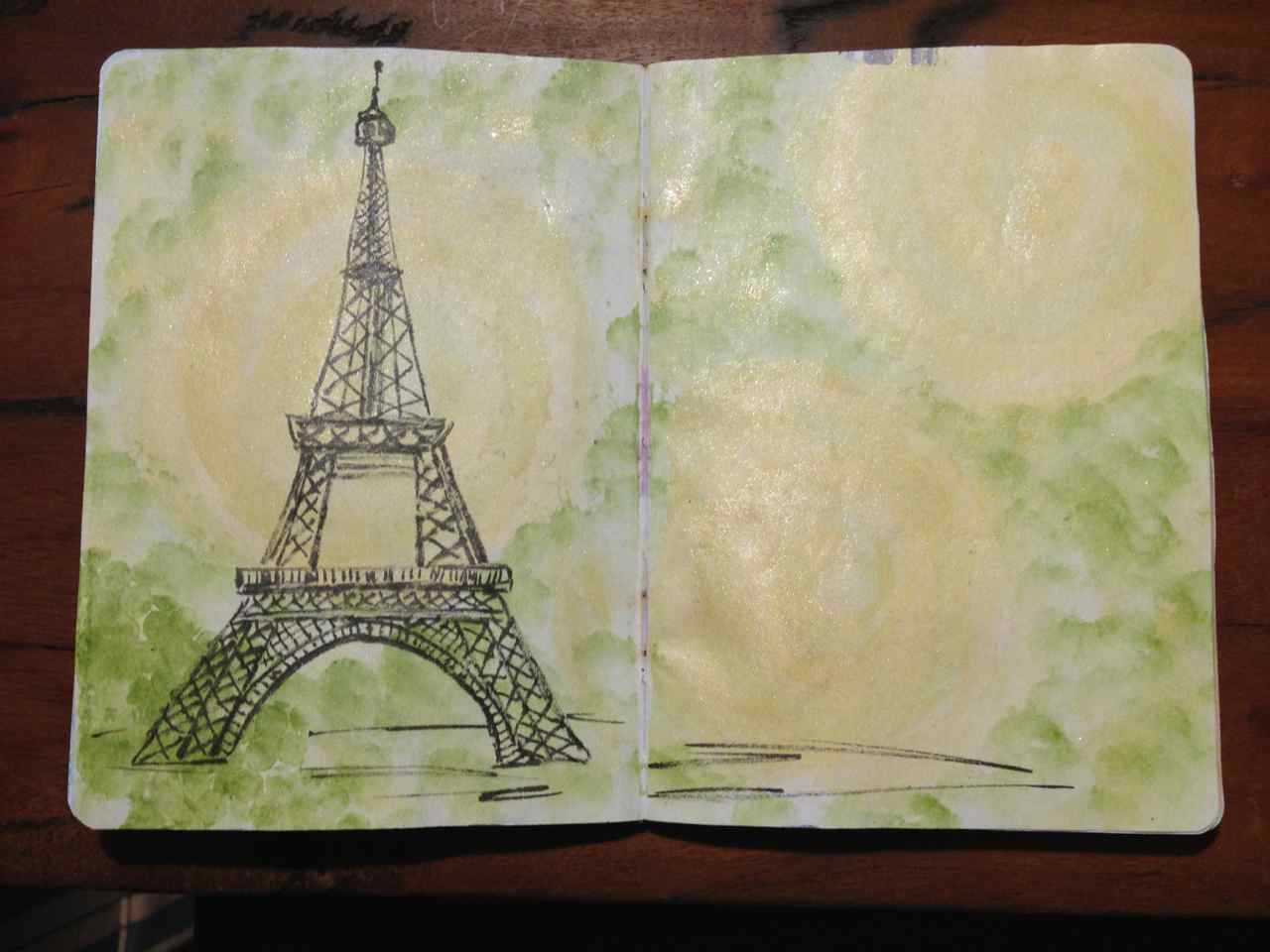
I originally had painted all the page spreads in my book so now I’m filling the book with line drawings of well-known landmarks of the world.  I love the irregular lines my PPBP, Pentel Pocket Brush Pen, makes on the pages… the india ink seems to fade to a charcoal gray.  It’s organic and subdued… not jarring.  I see this book as a travelog you can hold in the palm of your hand as I take you east around the globe visiting my vacation wish list!Sketchbook Project 4-5

Sketchbook Project 12-13

I pre-painted these pages before I even thought of my theme.  Now, I’m thinking serendipity is my friend.  I think the colors work well with the sketch locations.  I like how I have the gold streaming through the Eiffel Tower and especially the pinky-gold… it gives the Sphinx the feel of the desert sun.

Eiffel 4-5

Sphinx 12-13


Hmmmmmm… 2 continents so far.  Will I manage to visit them all?


IFJM…skylarkkarma.wordpress.com

The last few years I’ve participated in Roz Stendahl’s IFJM… International Fake Journal Month for the uninitiated.  It’s a chance for journal keepers to put on a different persona and journal as if you really were this individual.  Not forever, just a month… the month of April.  Just long enough to get a feel for the difference between this character and yourself. It’s a chance to be the person you always wanted to be or a chance to try out that career path you were fascinated with but never took for one reason or another.

As Roz says… “Life’s so short, why live only one?”

It’s possible for a Fake journal to be totally written but I’ve chosen to create visual journals. In the past I’ve uploaded my pages to a Flickr account but have found that problematic so I’ve created a new blog to hold both my previous years efforts and my fake journals going forward.  I’ve already started uploading my 2012 journal and will follow with 2013 before I start in on the planning for this year’s journal.  For those of you who have seen this before please bear with me as I go though my retrospective.  My intention is to be current by March when I’ll start planning the 2014 experience.

If you’re interested in IFJM as a concept please visit Roz Stendahl’s Official International Fake Journal Blog.  If you’re interested in learning more about Roz and her art please check out Roz Wound Up.

If you’re interested in my IFJM blog please go to skylarkkarma.wordpress.com

As if one blog wasn’t enough!

Inspiration in the Checkout Line

Can you say impulse buy?

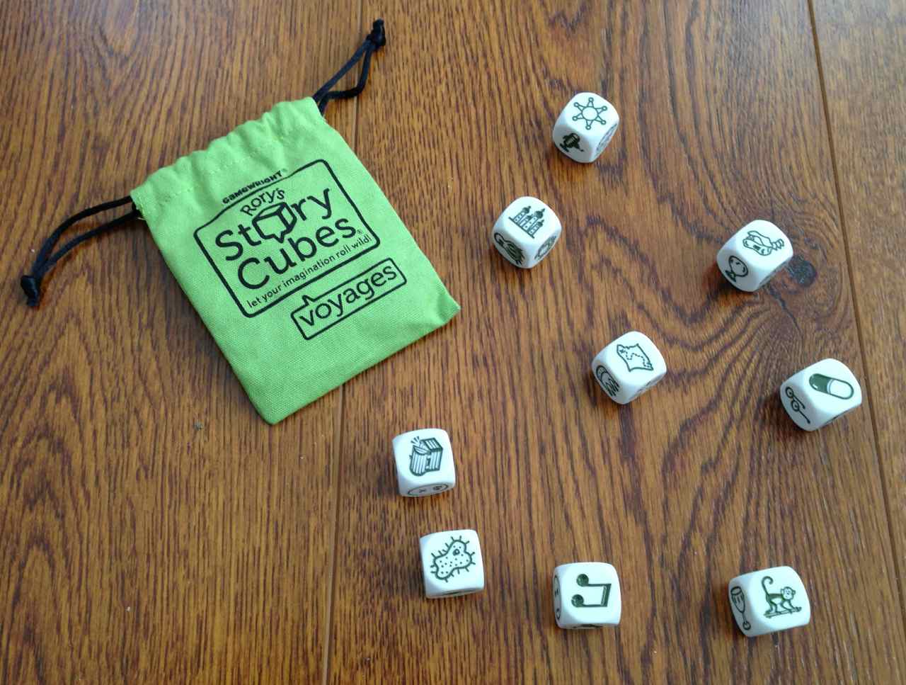
As I was in line to pay for my holiday shopping my eye was caught by a cute little lime green box.  Rory’s Story Cubes – Voyages.  I’m always looking for inspiration ideas and these images really appealed to me.  On sale too… I couldn’t go wrong!

Now I’ve always been drawn to dice even though I’m not a gambler.  I  love the feel of them rolling in my palms.  Nine dice… no dots… instead there are pictures, or should we call them icons?  This is a game for everyone age 8 and up.  That’s me!  The instructions are to roll the dice and then make up a story on the spot with the inspiration from the images.

Story Cubes - Voyages

You mean I have to use my imagination?  I quickly rearranged the cubes to suit my story:

My story

Once upon a time Bess lived in a downtown high-rise in the city.  One afternoon she felt feverish.  Her forehead was hot, hot as the sun, and her belly wasn’t right either.  Off she went to the emergency room where she was diagnosed with an amoebic infection to be treated with a high-dose prescription.  Once home she slept, exhausted from her day.  She dreamt she stood in the forest hearing faint cries.  What is it?  The sounds lured her into a clearing.  There she found a treasure chest and, uncaring of Pandora’s lesson, she immediately opened it.  Out jumped a monkey making the loudest ruckus.  He was screaming and screeching and was holding a scroll.  Bess leapt and wrestled the scroll from him.  As she looked closer she saw  it was a map to ancient archaeological dinosaur burial sites.  Bess thought, “Wait, a treasure map?  That only happens in dreams.”, and promptly woke up.

But, I’m not always going to make up a story.  I plan on using these one or two at a time as journal prompts.  Maybe I’ll create a page about my interest in western North American dinosaurs or one about moving to the country after growing up in the “Big City”.  With 9 cubes that’s 54 images… and there are two more sets: Original and Actions.

How great is that!

Paint Those Pages!

I had all sorts of great ideas of how I was going to fill my Sketchbook Project with all sorts of splashy watercolor… that is, until it arrived.  It has the absolutely thinnest paper I’ve ever worked on!  But I one of my goals was to use the sketchbook as-is.  No adaptations.

But I want color!

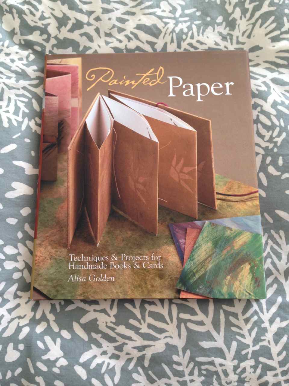
I thought of using colored pencils but I really wanted full backgrounds full of vibrant pigments.  I recently read Alisa Golden’s book from a few years ago, Painted Paper, where she promotes the use of acrylic ink dry-brushed across the pages.  Acrylic ink, NOT acrylic paint.  It doesn’t leave a plastic feel to the paper so the pages won’t stick even in humid weather and she claims it will be easier to write on.

Painted Paper book

Brilliant!  Well, believe me, even the driest dry-brush completely warped the paper.  Ah-ha!  I’ll iron it flat!  Amazingly, it worked.  I tried different techniques on each spread.  Some I brushed, some were stamped; I even hand cut a stencil from a cereal box and spritzed diluted ink onto the page.  Each time I ironed the pages dry and flat… ish.  They make a wonderful crinkly sound when turned.

SP 8-9

SP Stencil & Ink

Now I have a book filled with vibrant color.  Just what I wanted.

SP fanned

Hmmm… now to fill the book!  I’m going to pour myself a cup of peppermint tea and get to work.  These are the 2014 Official Themes: Strange Neighbors / Borders and lines / A simple place / Accidents / Found! / Dudes and latitudes / To the last page! / First aid kit / Say words out loud / Paper airplanes / This list… / Atlas of… / Greetings from… / 32 Days / This is not about you / This is not about me.

I’m thinking an atlas of…….