
When life gets overwhelming I turn to my sketchbook journal for solace.
If you feel the same, light a candle and repeat this mantra.
When life gets overwhelming I turn to my sketchbook journal for solace.
If you feel the same, light a candle and repeat this mantra.
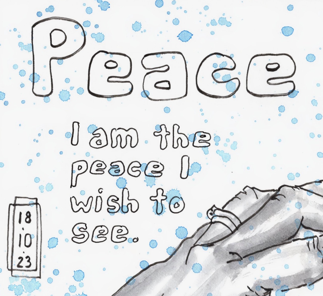
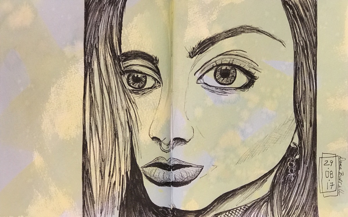
Since I’ve been ignoring this blog for too long I’ve started clearing out a bunch of half-done and currently irrelevant blog posts. This one was saved because it shows how I work out the stressful times like I had late last summer.
I go basic. Pen and ink and my journal.
I had to refresh my memory by revisiting that journal but it’s clear now. I drew this at the end of a long day in the midst of a long month of long days.
Fortunately, things have gotten better or maybe it’s just that I’ve gotten better at handling the stressful times but I’m going to continue to carve out time for pen and ink drawings. They are my comfort and solace.

Life isn’t about finding yourself. Life is about creating yourself.
— George Bernard Shaw
Earlier this year I swore I wouldn’t sign up for any classes this year. Instead, I said to myself, I’ll work through some previous classes that I haven’t finished and also revisit some classes that I found particularly useful.
That lasted two whole months when I caved and signed up for Sktchy’s 30 Gouache Portraits in 30 Days. Confession time… I completed exactly ZERO portraits. That just means I can add that course to my burgeoning list of uncompleted art classes.
I continued to work on my other art projects including my tenth Fake Journal for International Fake Journal Month in April, re-scanning most of my fake journal pages, and creating slideshows for each one. (By the way, if you haven’t had a chance to see my fake journals please visit my dedicated Fake Journal blog, Skylark Karma, skylarkkarma.wordpress.com. All the videos will be posted by Wednesday, June 23rd and the final wrap-up of my entire Fake Journal experience is scheduled to post on Friday, June 25th).
Anyway… did I learn my lesson about signing up for classes? No, not really.
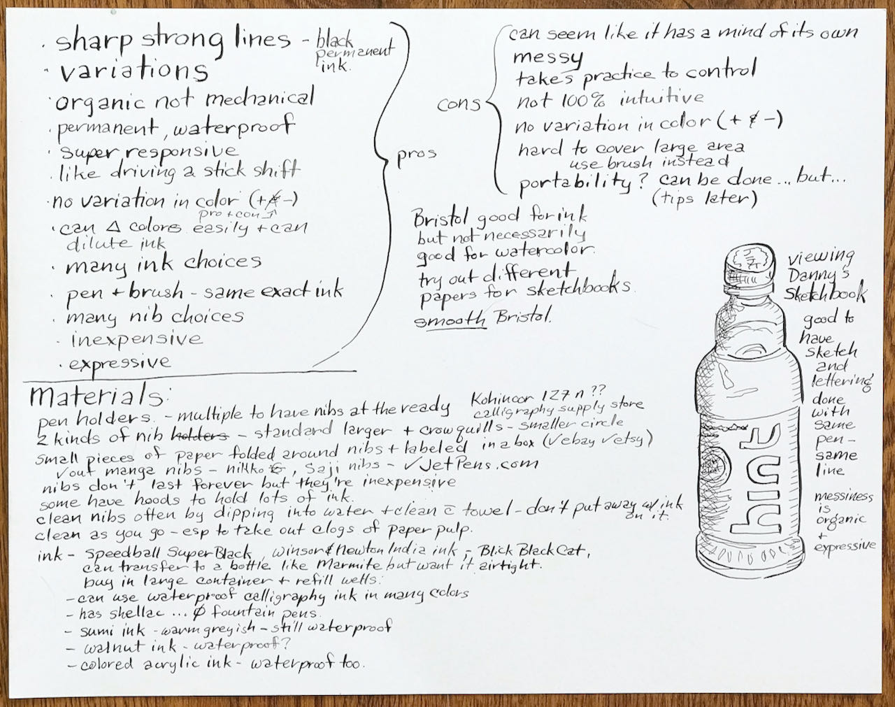
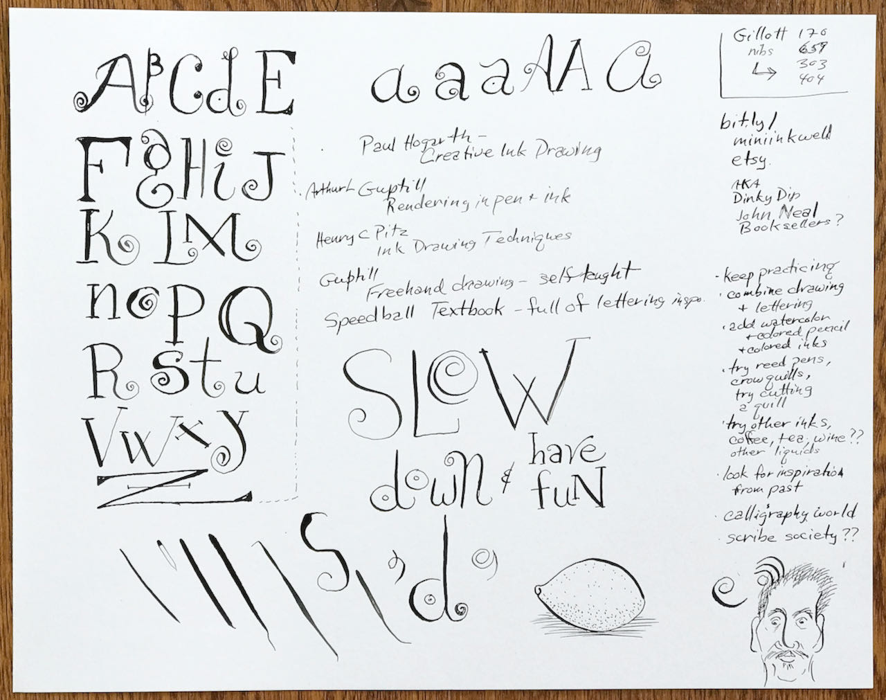
I tried to ignore the emails from Sketchbook Skool but the lure of a half-day workshop on creating art and calligraphic text with a dip pen was just too good to pass up. Danny Gregory, one of the founders of Sketchbook Skool, was sharing his tips and tricks.
I already had the dip pens, assorted nibs and a few bottles of India ink… how could I pass it up!
We first practiced our strokes and drew a couple of drawings while Danny filled us in on the pros and cons of working with dip pens and showing how he creates his freeform calligraphy alphabet. I took notes and worked along with the webinar.
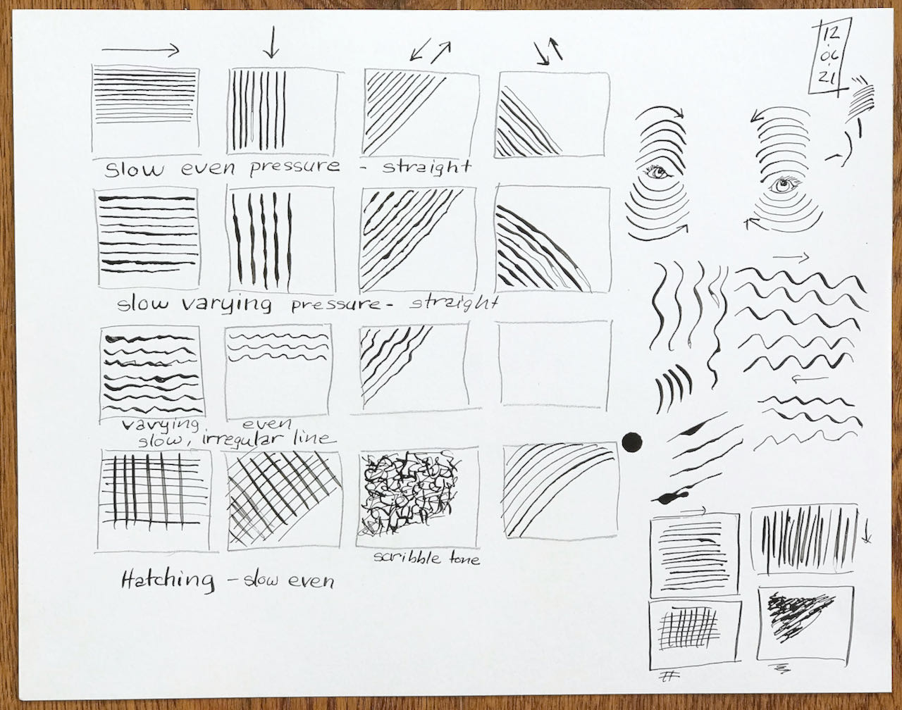
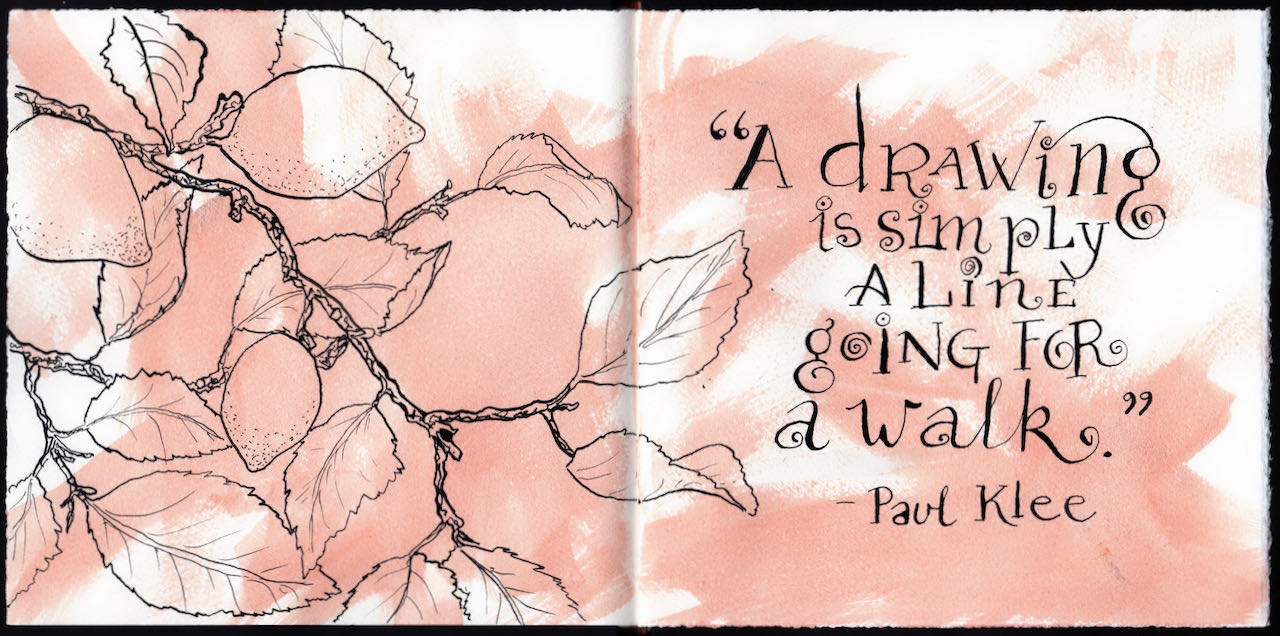
I inked this quote of Paul Klee’s along with Danny, copying his alphabet stroke for stroke and line for line. When I opened my book the next day, the large open space to the left just begged for an illustration. Out came the dip pen, G nib, and India ink but this time I was much more confident of my line.
Thanks Danny Gregory and Sketchbook Skool!
It’s nearly summer and my garden’s screaming for attention. Yes, weeding but more importantly, watering! We’re in a drought and when I look at the 25 day weather forecast I don’t see any measurable rain in our future.
That’s why I’ll be out watering the garden when this posts in the morning. I don’t water grass and the garden beds take somewhere around an hour and a half. My coffee will just have to wait ’till then.
In the meantime here’s a spread I did for a class… my left hand.

Am I busy… oh yeah!
Not only is Panera a great place to meet friends for lunch but there are always plenty of interesting victims subjects to sketch. I had a great time catching up on everyone’s comings and goings as I practiced with my Sailor Profit fude nib pen.

I also tried out a new charcoal pencil that works like the old style peel-away China markers. You can see that image in the top left of the next image. I usually don’t like working with charcoal or even graphite in my sketchbook as it smears too much but I couldn’t wait to give it a go.

I’ll think I’ll save the charcoal for life drawing and keep on working with ink and watercolor in my sketchbook. Both the paper and my hands stay cleaner that way.
Back in early January I saw my sketchbook filling up with images but no writing. I realized just how much I missed musing about my days.
Purposeful journaling about my most mundane daily activities was the only way to change that trajectory.
BTW… the Center for Disease Control truly believes shingles is dangerous and one of the worst things to plague humans. Get vaccinated!
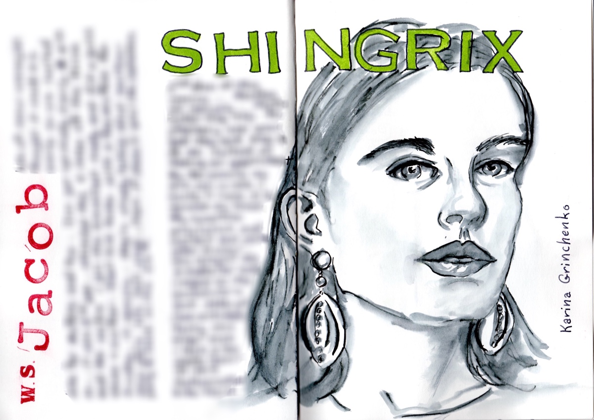
Portrait of Sktchy muse Karina Grinchenko in an A5 portrait format Hahnemühle Nostalgie. Journaling obscured for privacy.
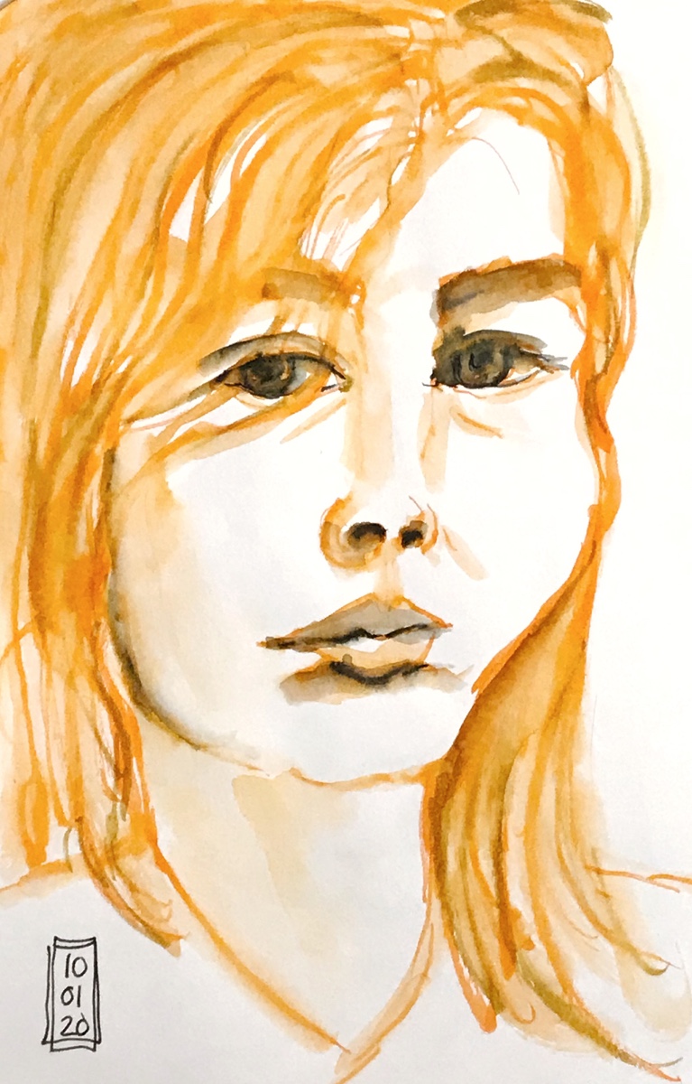
I love watersoluble pen and ink work because sometimes you feel like keeping a line and sometimes you don’t.
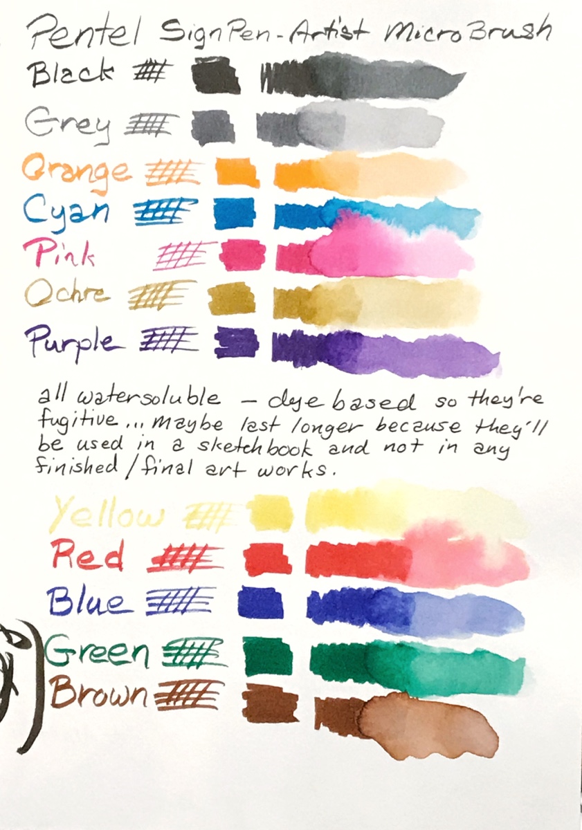
On Roz Stendahl’s blog and her Patreon site, Roz Interim, she demonstrated the Pentel Sign Pen – Artist Micro Brush. They’re dye based and water-soluble, perfect for shading with a touch of water, and on top of that they have a super fine brush tip! You can see that in the photo below.
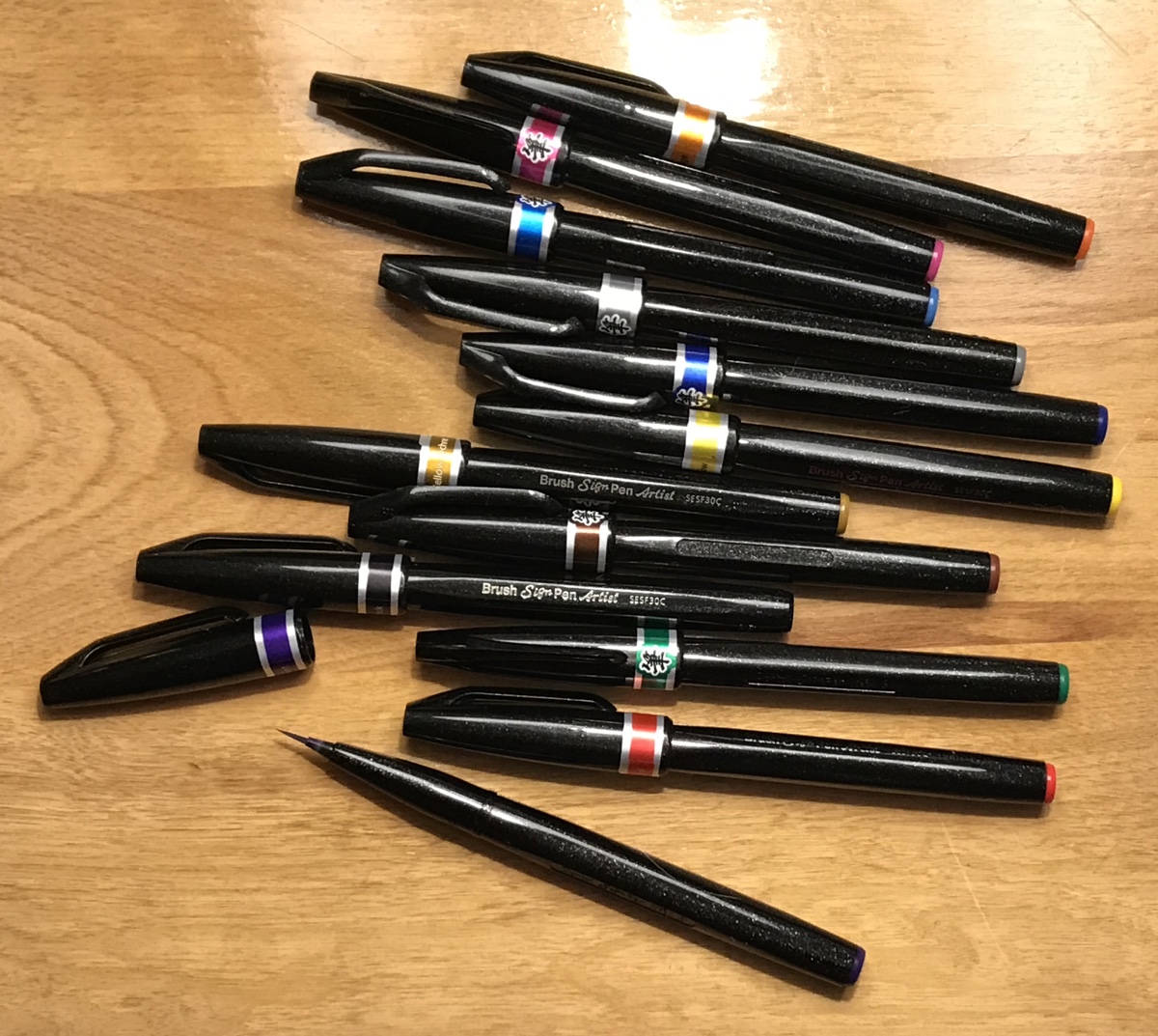
I was able to find both sets of 6 at my local Michael’s and immediately set to testing.
Portraits don’t always have to be realistic, do they?
Hahnemühle Nostalgie – A5 portrait
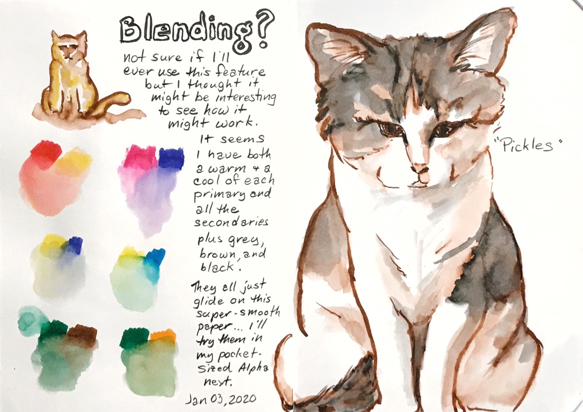
Sometimes I’m just busy… it doesn’t mean I’m not drawing. I sometimes just get too preoccupied with other stuff that I forget to post!
My drawing sessions this month consisted of squeezing in a sketch or two whenever I had a spare moment like the week long stretch when I sketched portraits from an app called Sktchy.


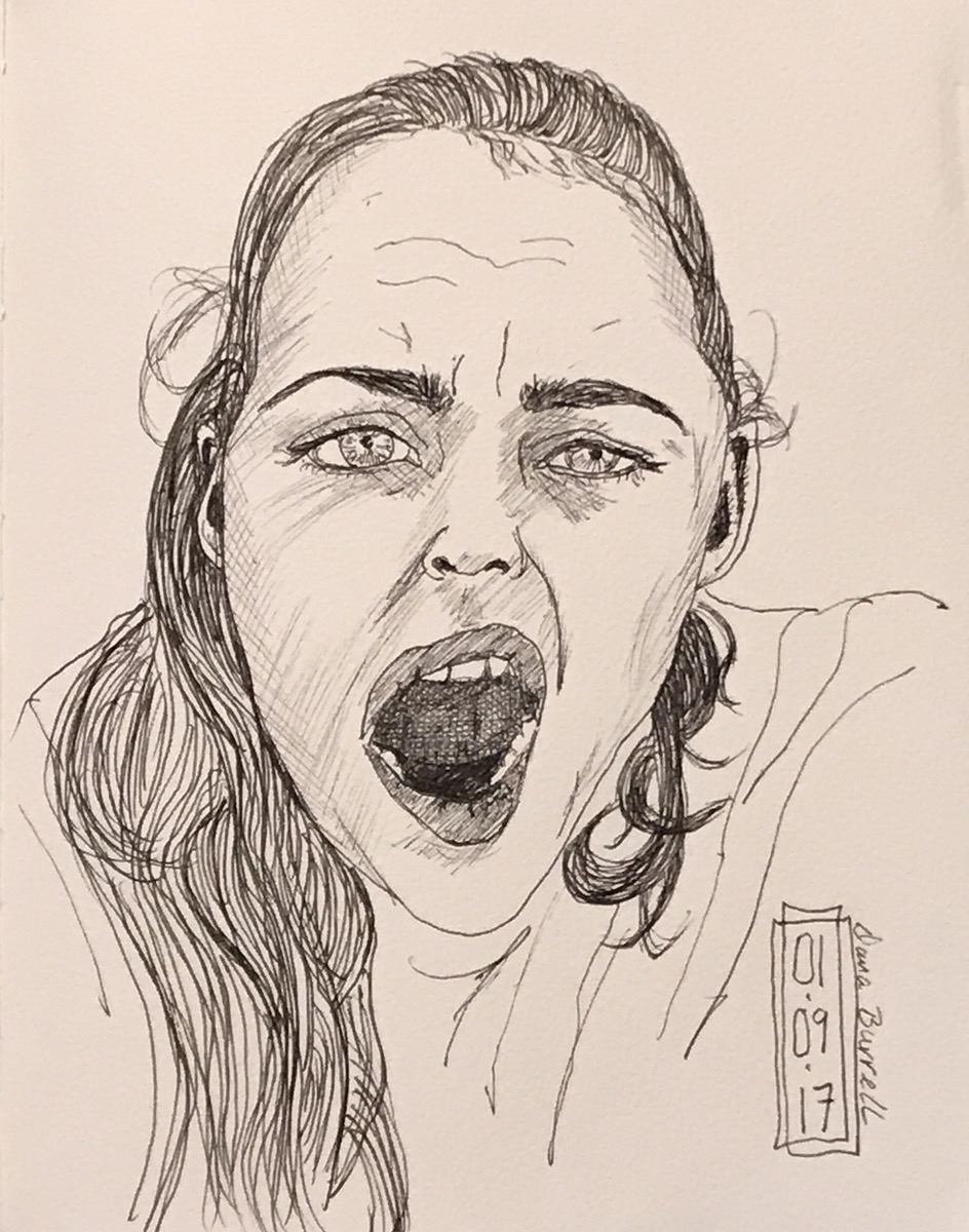
I think you can see how more confident I became with my ink line as the week went on.
I’ll share more about Sktchy soon but tomorrow’s October and… October is InkTober! I doubt I can manage daily posting so I’ll be aiming for weekly updates. Stay tuned.
Total Solar Eclipse… yeah, but not here.
2:43 PM… 61% of the sun eclipsed here in the Upper Valley. I didn’t have acceptable eclipse glasses so I punched a few different sized holes in a scrap piece of cardboard as a makeshift pinhole device. It took me a bit but I managed to capture a photo. Not a great photo but it’ll do.
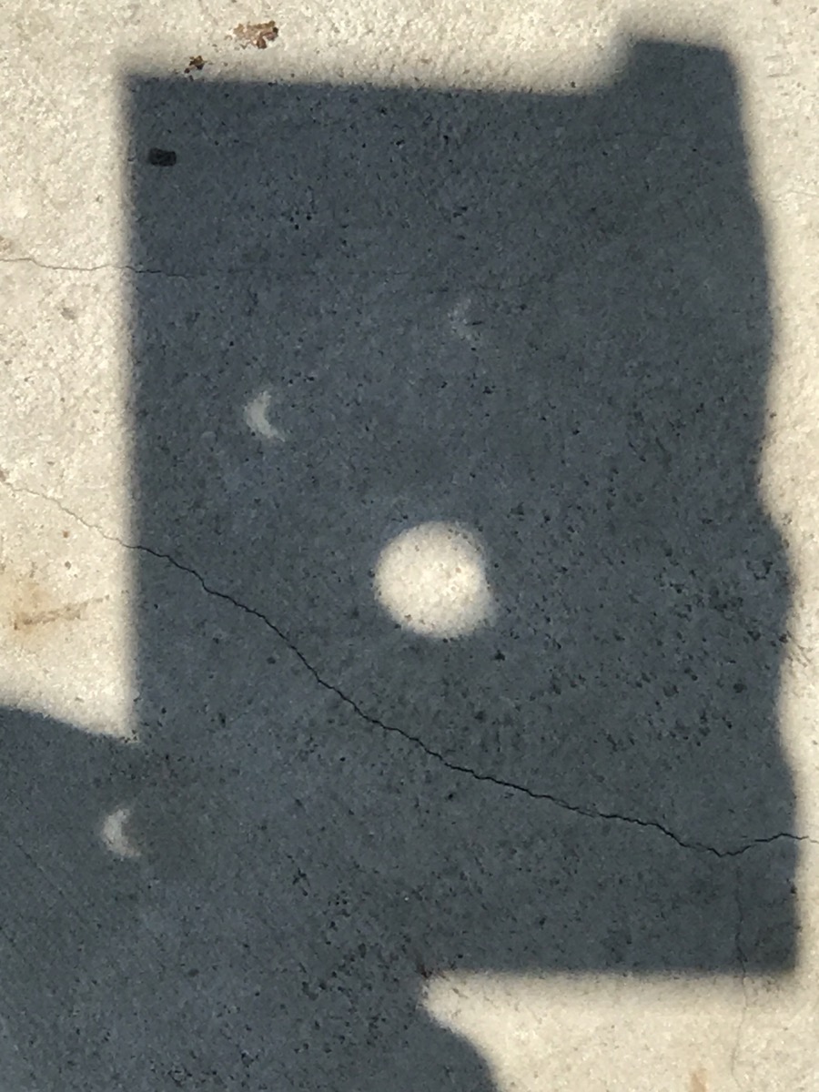
I believe the light dimmed a bit and it certainly had a weird glow but how can you capture that on a page?
I didn’t… instead I chose to celebrate the day by painting what I think of as the essence of a total eclipse… the sun’s corona!

I’ve put April 8, 2024 on my calendar… I’d love to see totality!
… be an optimist!
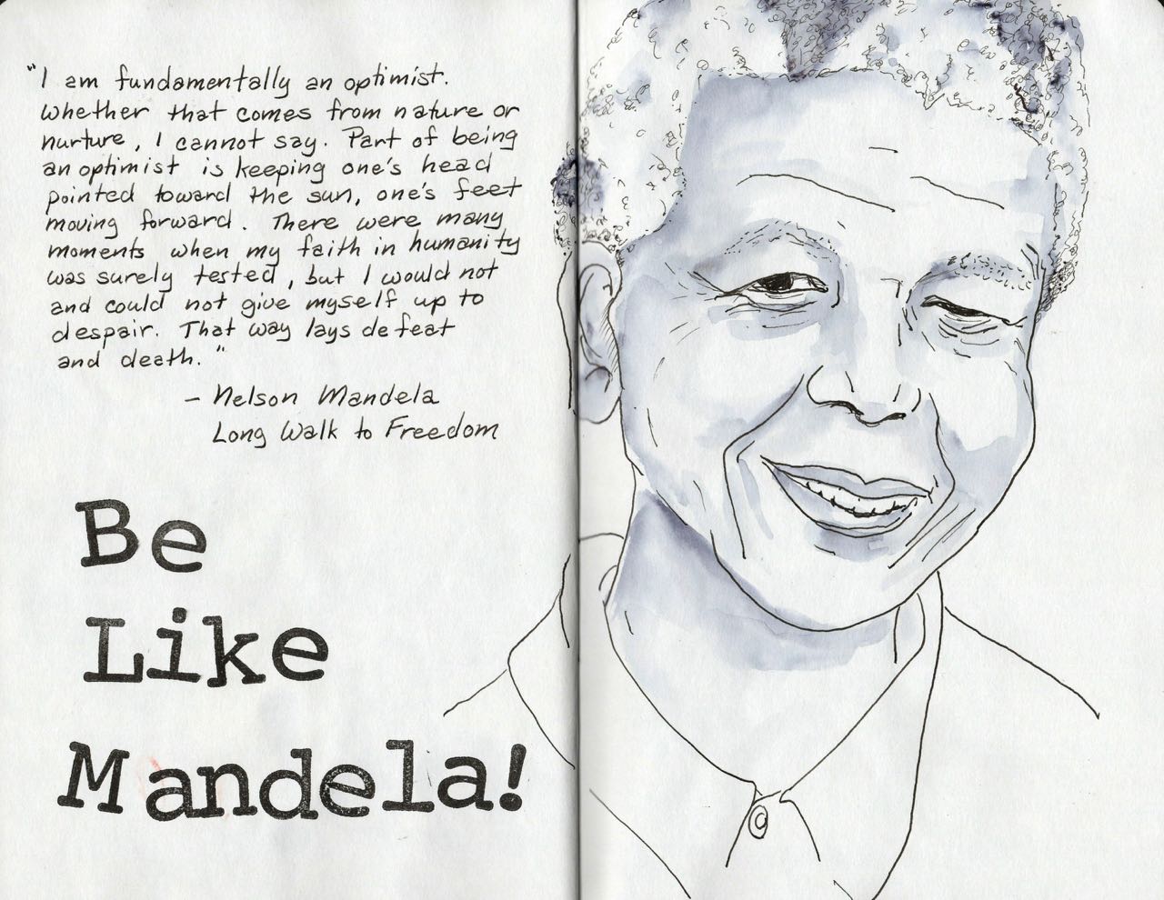
“I am fundamentally an optimist. Whether that comes from nature or nurture, I cannot say. Part of being an optimist is keeping one’s head pointed toward the sun, one’s feet moving forward. There were many moments when my faith in humanity was surely tested, but I would not and could not give myself up to despair. That way lays defeat and death.”
——- Nelson Mandela, Long Walk to Freedom (1994)
18 July 1918 – 05 December 2013
