Earlier this year I swore I wouldn’t sign up for any classes this year. Instead, I said to myself, I’ll work through some previous classes that I haven’t finished and also revisit some classes that I found particularly useful.
That lasted two whole months when I caved and signed up for Sktchy’s 30 Gouache Portraits in 30 Days. Confession time… I completed exactly ZERO portraits. That just means I can add that course to my burgeoning list of uncompleted art classes.
I continued to work on my other art projects including my tenth Fake Journal for International Fake Journal Month in April, re-scanning most of my fake journal pages, and creating slideshows for each one. (By the way, if you haven’t had a chance to see my fake journals please visit my dedicated Fake Journal blog, Skylark Karma, skylarkkarma.wordpress.com. All the videos will be posted by Wednesday, June 23rd and the final wrap-up of my entire Fake Journal experience is scheduled to post on Friday, June 25th).
Anyway… did I learn my lesson about signing up for classes? No, not really.
I tried to ignore the emails from Sketchbook Skool but the lure of a half-day workshop on creating art and calligraphic text with a dip pen was just too good to pass up. Danny Gregory, one of the founders of Sketchbook Skool, was sharing his tips and tricks.
I already had the dip pens, assorted nibs and a few bottles of India ink… how could I pass it up!
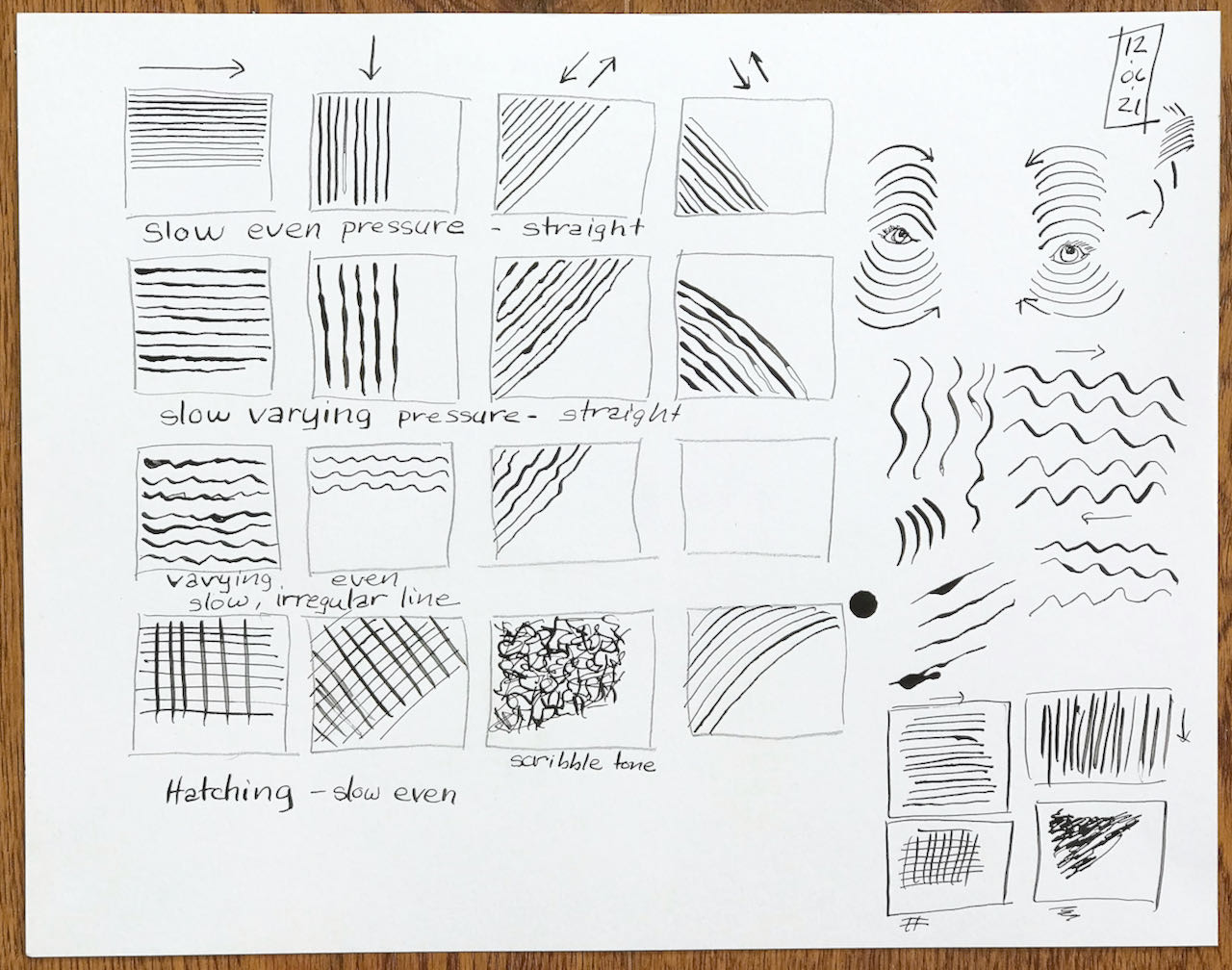
We first practiced our strokes and drew a couple of drawings while Danny filled us in on the pros and cons of working with dip pens and showing how he creates his freeform calligraphy alphabet. I took notes and worked along with the webinar.
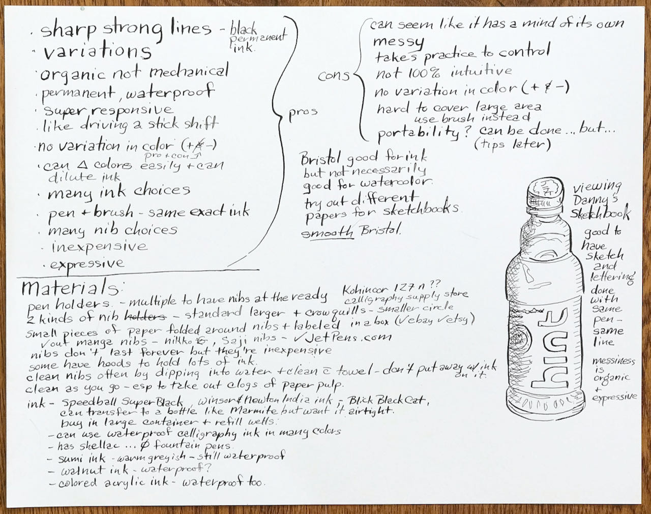
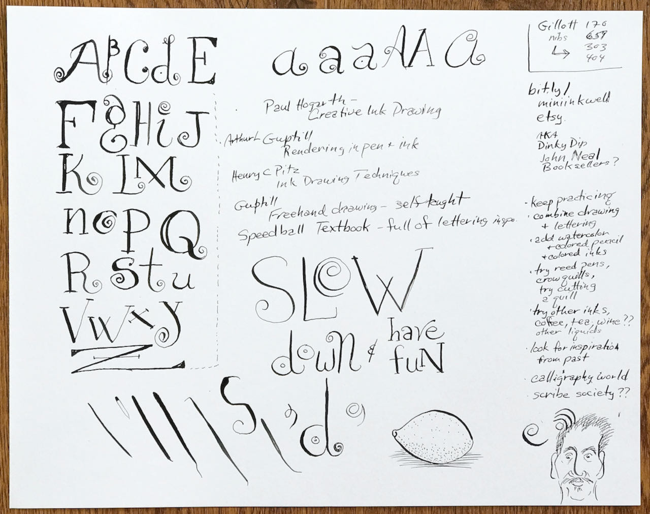
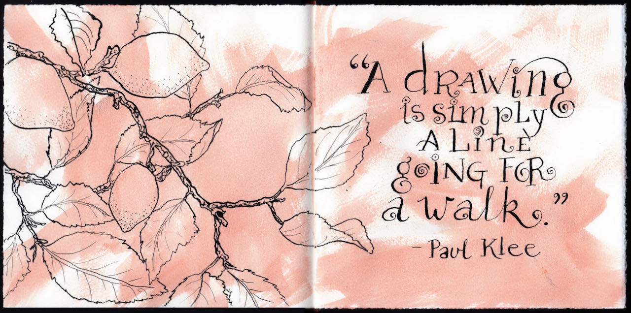
I inked this quote of Paul Klee’s along with Danny, copying his alphabet stroke for stroke and line for line. When I opened my book the next day, the large open space to the left just begged for an illustration. Out came the dip pen, G nib, and India ink but this time I was much more confident of my line.
Thanks Danny Gregory and Sketchbook Skool!