Ink… particularly, white ink for illumination, written with a dip pen.
For the life of me I can’t remember which of these Higgins inks I liked better. I vaguely remember thinking I preferred the opposite of what I presumed would be the better choice. If that’s true, then I preferred the basic White over the Super White.
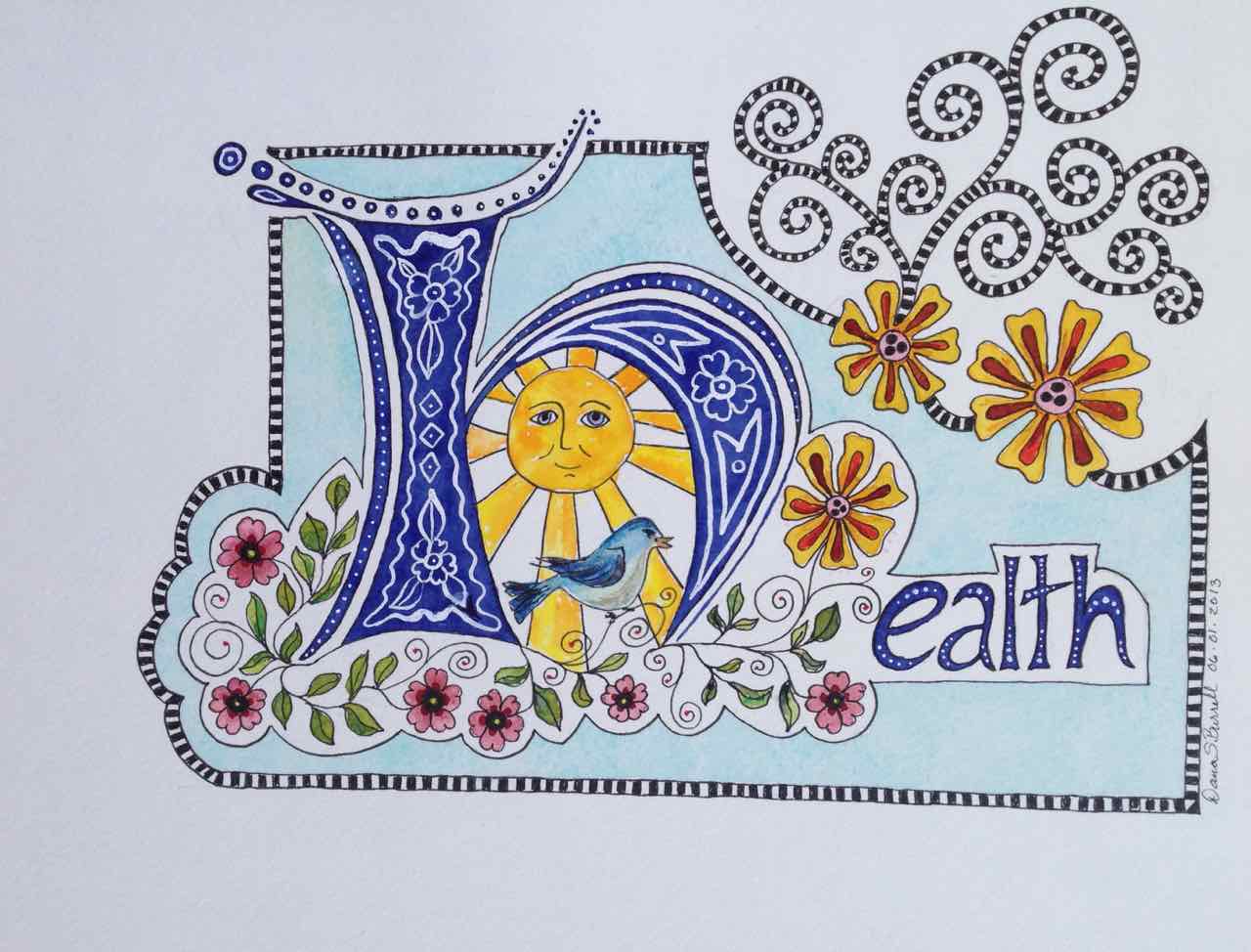
Done on saturated watercolor for a Val Webb class – Drawn and Decorated Watercolor Lettering. Highly recommended! … and you can give it a try … she’s giving the class again in June. Check it out here!