I started blogging here near the end of 2013 and haven’t changed a thing on this site since then.
Well it’s about time!
If you’re a newish reader then you might not know I actually have a second blog where I keep all the “fake” journals I’ve created the last few years… well, they’re real journals, but each one has been kept by a persona I take on for the month of April.
April is International Fake Journal Month… IFJM for short. Roz Stendahl is the brains behind this activity and I wholeheartedly join in by adopting a character and journaling as this person, all the while posting images of this work daily, or nearly so.
I make references to this blog… Skylark Karma… when I lead up to April but ’till now I’ve never had a sidebar widget of my own. When you’re on the home page you can see the image of a crow on the right; it’s done in gouache and marked up with my blog address. Just a simple click of the image and you’ll be whisked off to browse my current and former fake journals.
I had a great time creating this image. First, I drew a rough outline on a prepainted acrylic background in my Pentalic Aqua Journal before going in with gouache. There are passages where the line drawing shows through and others where the gouache is applied thick enough to hide and correct the misdrawn lines.
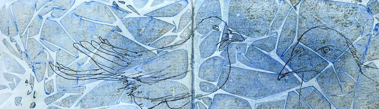

I love this full spread but a closeup of one of those faces would make a great image link. But which one? If I used the one on the left, he would be looking away from the body of this text.

… and it’s blurry, especially behind the eye.
But the crow on the right… that’s the one!

I love how the blues, greens and purples all combine to say – black.
I ran it through my photo processing software to add the lettering and… Voilà! … I have a permanent link to my Fake Journal blog.
Please visit and see who “I am” and what “I’ll be creating”. The magic starts this Saturday, April 1st. Join the fun!