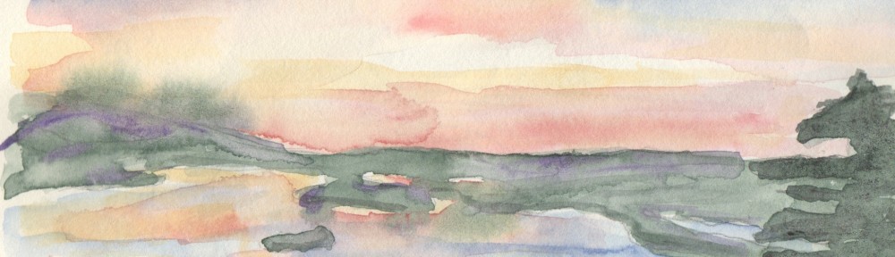
Yet another version of some of my favorite subjects.

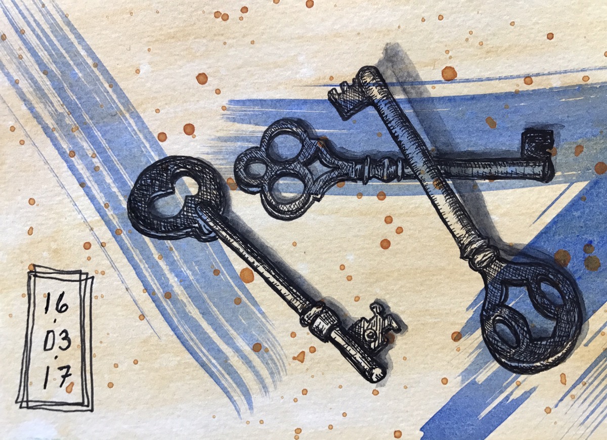
Faber-Castell PITT artist pen on an acrylic prepainted background on 300 gsm (140 lb.) paper in a Pentalic Aqua Journal.
Note… this may be my least favorite journal. I’m finding the cold press texture of this paper to be a little too regular and predictable for my liking. One good thing… this paper has a different texture on each side and Pentalic has made the effort to collate the papers ensuring the textures are matched across the spread.

Catching up on my Dana….
LOVE the old keys, sorry the paper ain’t working for ya. Pretty cool as usual!! And the blue, just love the blue!
I love your style, presentation, and theme, Dana 🙂 Also, ironic, I have one of those Pentalic journals and had set it aside for my trip in June. I will do an ink and pencil and wash and tint test on the back pages before I head out! Thanks for the heads-up!
You might love it! I think some of my problem might just have been the landscape format. I should have blamed that and not the paper. It’s nice and heavy and handles washes well. Give it a try!
I love old keys. They seem to have a story behind them. They also remind me of my fathers grandfather clock, he kept that key in his safe spot so nobody could wind his clock.