J is for Journals (Blogging A to Z)

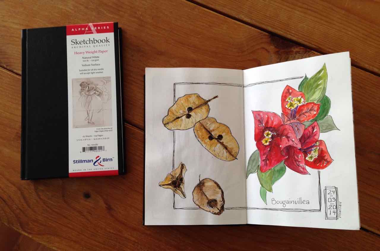
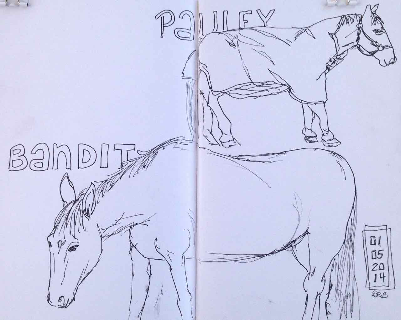
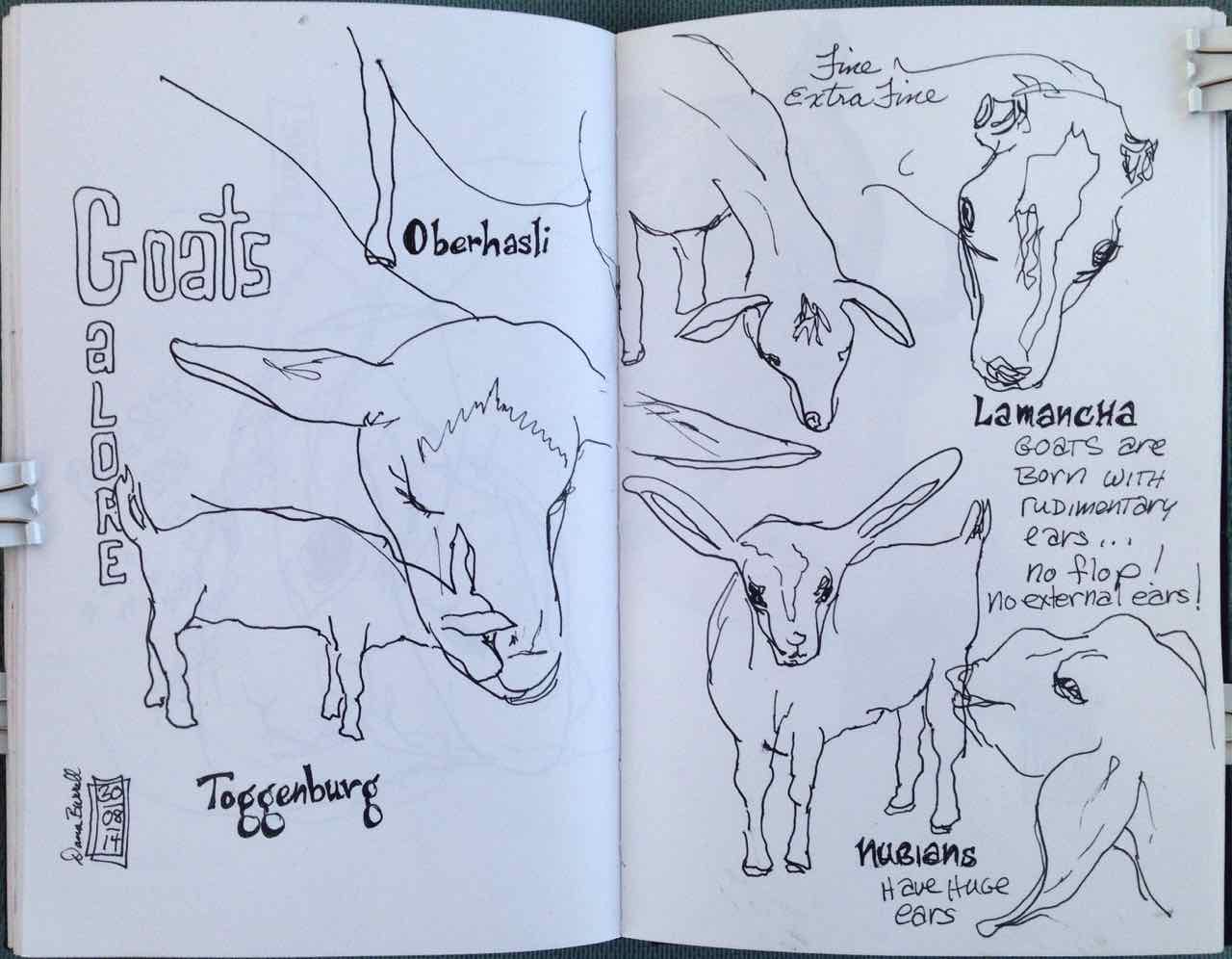
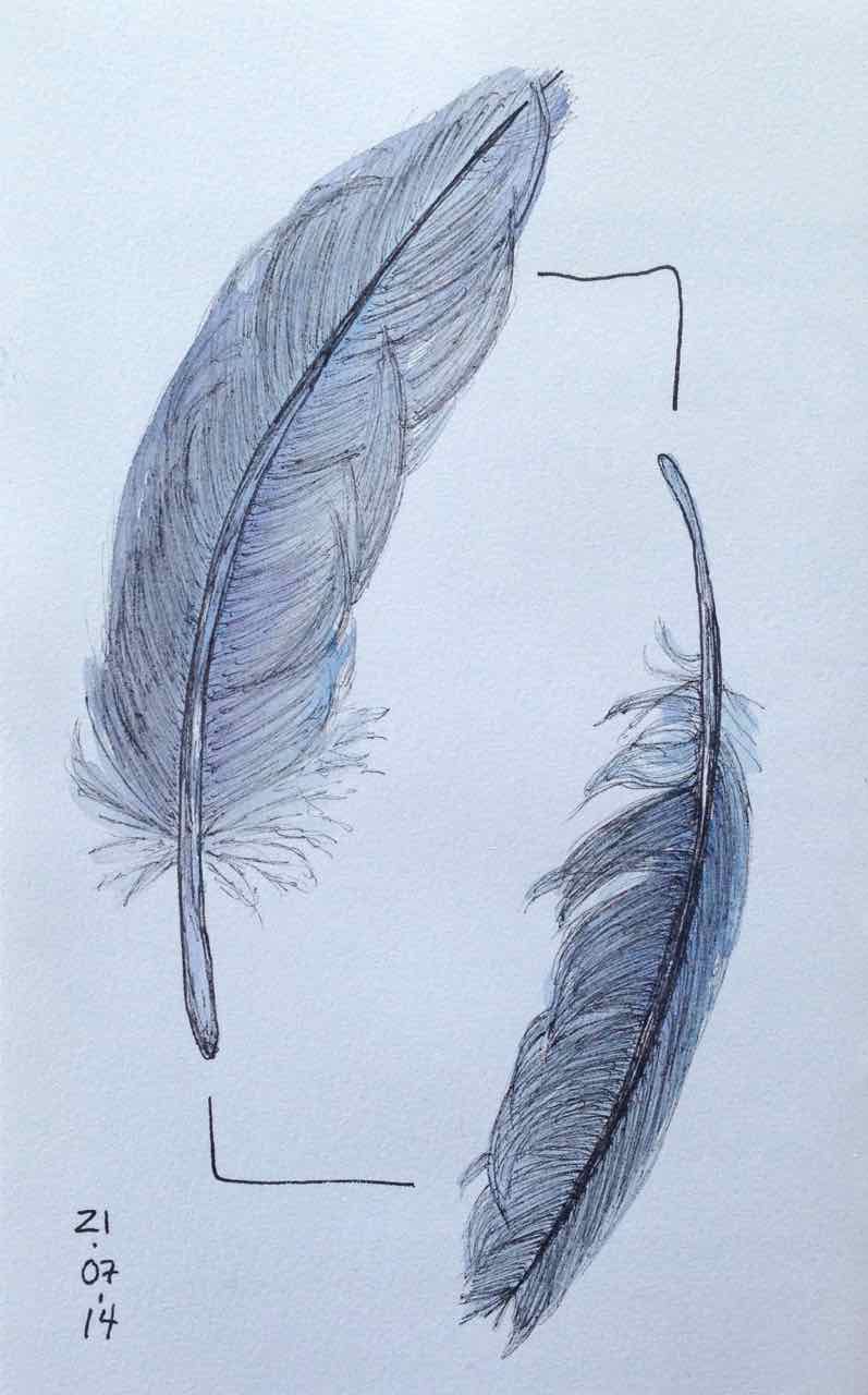
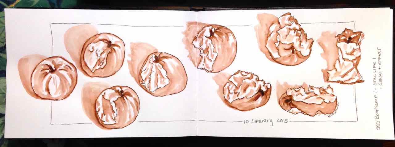
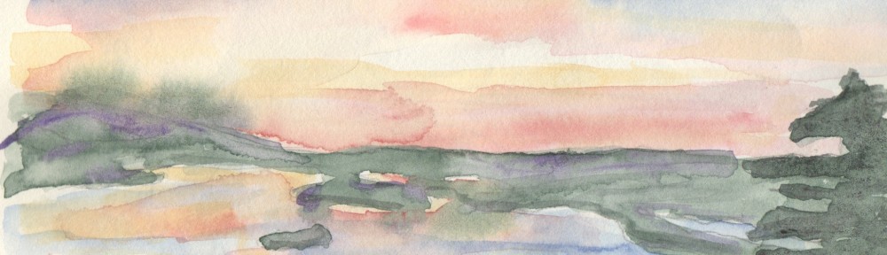
Some people prefer their journals in Portrait format and others prefer Landscape format.

Portait will yield an almost square surface when open, while Landscape will yield an even more extreme horizontal rectangle.  I think it’s extremely important to try both to feel how each sits in your hand and how you respond to the format with your art and style.  Each will present you will different challenges and opportunities.

As for me… I go both ways.

J-journal1

J-journal2


I is for Ink (Blogging A to Z)

Ink… particularly, white ink for illumination, written with a dip pen.

For the life of me I can’t remember which of these Higgins inks I liked better.  I vaguely remember thinking I preferred the opposite of what I presumed would be the better choice.  If that’s true, then I preferred the basic White over the Super White.

Done on saturated watercolor for a Val Webb class – Drawn and Decorated Watercolor Lettering.  Highly recommended! … and you can give it a try … she’s giving the class again in June.  Check it out here!

I-illuminated ink

I-ink


B is for Brushes (Blogging A to Z)

Brushes… particularly travel watercolor brushes.  I love, love, LOVE the first three… and what a lovely present they were!  From Left to Right…

Escoda Versatil, size 10

Isabey Squirrel Mop #6202

daVinci Ussuri sable #1523, size 6

Daniel Smith 23-0 Synthetic Travel, size 8 (discontinued)

daVinci synthetic, size 5 (came free with a watercolor set)

B-brushes1

B-brushes2