In a Slump

When I feel uninspired and have stopped creating for a few days I rely on a few trusted methods for breaking out of my slump. I often try out new tools or pre-paint some journal pages, but the most reliable slump-buster is to draw a prompt from Danny Gregory’s EDM list

Whenever I feel blocked I remember my plan to eventually work through all 328 prompts.

This is No. 121


I’m not out of the clear yet but I’m going to keep at it. As Pablo Picasso said, “Inspiration exists, but it has to find you working.”

Sketching the Sketchers

Our local college, Dartmouth, has closed its Hood art museum for two years as it renovates and expands. In the meantime they’ve created an exhibition space in a previously empty storefront downtown… cleverly named Hood Downtown. Last Thursday night they had a “Sip and Sketch” event featuring noshes and drinks. (White wine, ginger ale, Perrier…nothing with color in case there were was an “incident”.) 

The museum had set up two beautiful 360 degree still lifes for us to draw. I briefly thought of sketching the objects but instead decided to sketch the sketchers. My subjects were so intent on their own work they never knew they were models!


The Hood, like many other museums, has a policy of allowing only pencils for drawing in its exhibition space. That’s okay by me… the humble pencil is a powerful tool!

If you’re in the area be sure to see the current exhibit, Bahar Behbahani’s Let the Garden Eram Flourish. It will be on view through March 12, 2017. 

Here’s just one of Ms. Behbahani’s stunning works… Adorned With Pillars (mixed media on canvas). 

Greenhouse Caladiums

There’s nothing better on a cold winter morning in the northern hemisphere than a trip to a greenhouse to soak up the warmth and bask in the green.

The Murdough Greenhouse at Dartmouth College hosted our plein air group yesterday morning. Every time I visit I’m struck by how fortunate we are to have this space and the vast selection of blooming specimens. 

I chose to paint this Caladium specifically because of its coloration. As you can see… pink and green… complementary colors. Could I paint it without creating big blotches brown?


My patience was tested as I had to wait for each consecutive layer to dry, but that’s exactly why it’s so great to paint with like-minded friends. We caught up on events and admired each other’s works. 

I love Thursdays!

Toys Are Us!

As we come to the end of January I figured I’d share some of the art supplies I’ve been playing with. 

Remember my childrens quality multicolored pencil?  I like it so much I’m putting the artists quality Koh-i-noor Magic Pencil on my wish list. 


See how the colors run the length of the pencil… that means that you need to rotate the pencil as you draw to get color variation. The Koh-i-noor has the colors all swirled together. I’m betting that will be even more fun!

I also bought a new white ink pen… a Uni-Ball Signo Broad. I’ve had nothing but trouble with the previous incarnation Signo pen but this one is a winner!  The barrel on the newer pen is opaque while the barrel on the “inferior ” pen is translucent. It may be coincidental but I thought I’d mention it in case you’re thinking of getting one for your arsenal. 

Lovely opaque white ink. Here I’ve layered it over many layers of watercolor. 


We have a lovely new stationery, card, and art supply shop in the area… POST… in White River Junction, Vermont.


I bought myself a few Palomino Blackwing pencils to try and the corresponding long point sharpener. I’ve heard so many glowing things about them I just couldn’t resist. Now that they’re sharpened I need to make some time to test an experiment to see which level of hardness I prefer. 


And finally… I found out that it’s possible to sketch on my phone using only the Note app and my trusty index finger. 


See ya… gotta use some of these things and go make some art!

Rainy Day Sketching

It was too cold and too rainy yesterday to sketch outside. I suppose we all could have sketched in our cars but that defeats the whole purpose of getting together!

Lucky for us, one of our fellow artists has an old Victorian home overflowing with interesting objects set up in eye-catching vignettes. No matter where you look, there’s something to sketch… even some Christmas decorations. 

I didn’t have time to add color to the larger spread and now I’m not sure I want to. I do have a reference photo but……..

Sometimes it’s better to leave well enough alone. Besides, that was yesterday. Surely I can find something to paint Today!


January Portraits

The year is young but my January seems to have a theme already. Portraits.

I’ve drawn people 4 of the first 5 days and I’ve really enjoyed capturing folks in a variety of sketchbooks using various media. 


Platinum Carbon Black ink on prepainted background. 


Child’s 4-color pencil on mixed media paper. 


Ink and watercolor pencil on thin sketchbook paper. 


Watersoluble ink and watercolor. 

The more I practice, the more comfortable I am sketching random people but now’s the time to focus on drawing my friends and family more often. Most are strangely absent even though they mean so much to me. I think this is the year to rectify that. 

2016 Retrospective

As the year closes, I spent yesterday paging through my six sketchbooks encompassing 2016.  I was inspired by two of my favorite sketch bloggers, Suhita Shirodkar of Sketch Away and Tina Koyama of Fueled by Clouds & Coffee, for their posts featuring the year’s top highlights.

Instead of doing a top 10 retrospective I’ve chosen a previously unpublished sketch from each month.  These sketches are examples of my day in, day out journal work.  It’s also some of the work I’m most proud of, not because of its quality but because it shows my persistence as I stretch to improve.

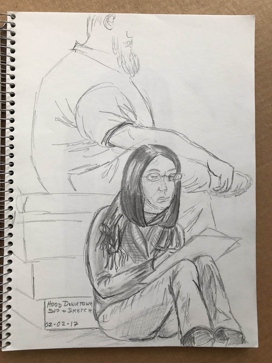
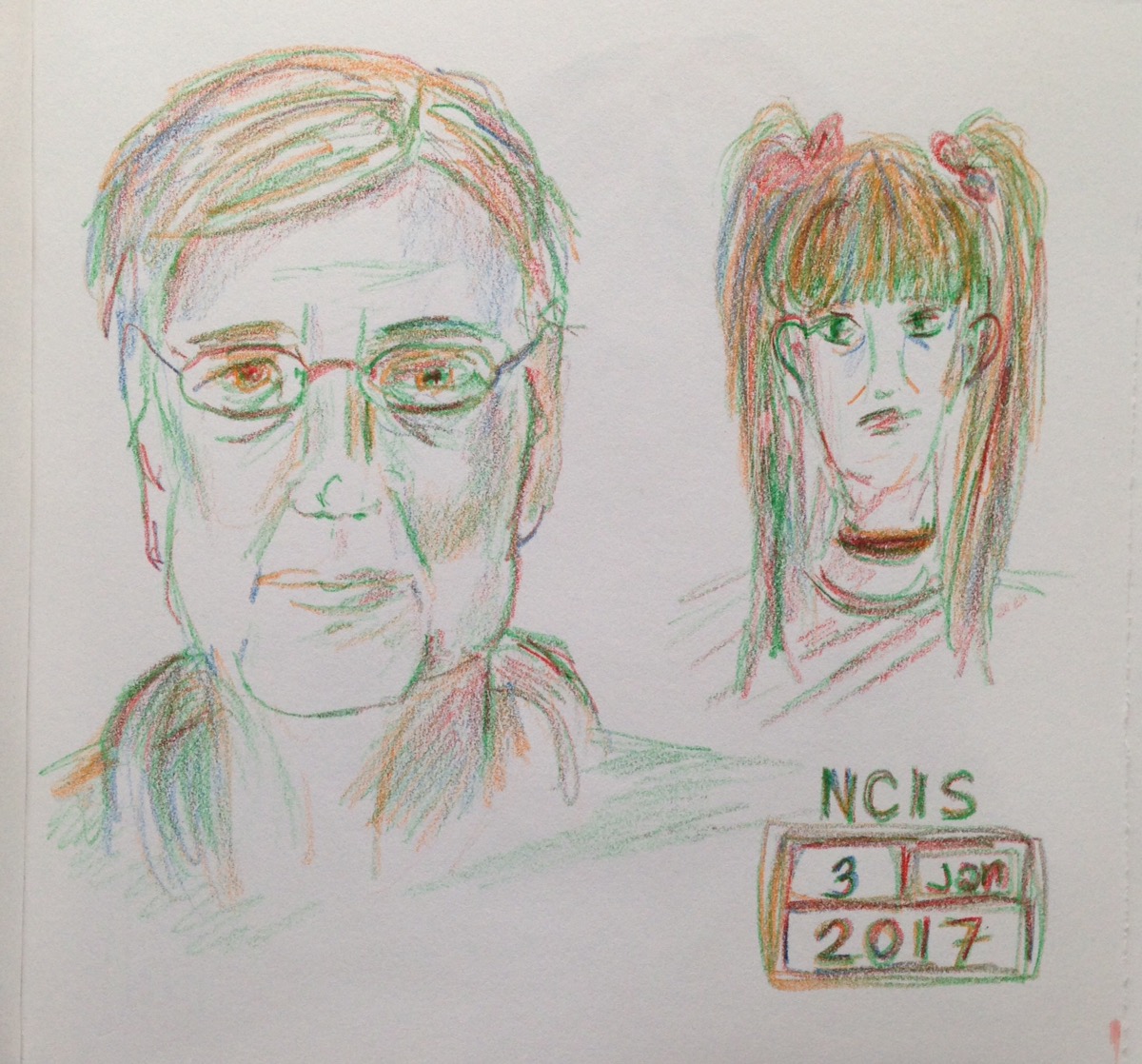
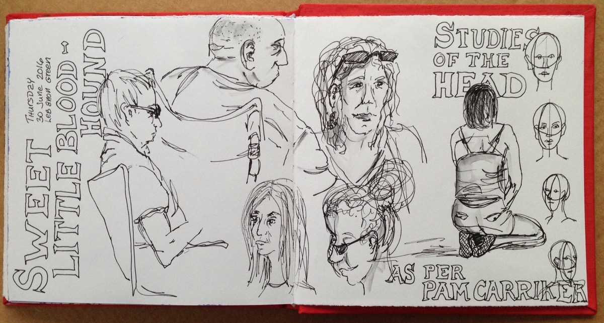
January: Portrait practice. I go where I know there’ll be a steady stream of victims models.

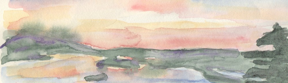
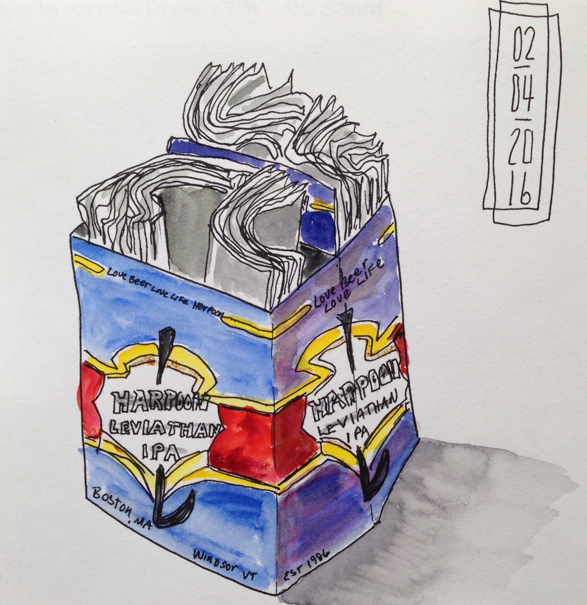
February: View out my back door. Used complementary colors and didn’t get mud!

March: Right place, right time with sketchbook at hand.

April: Working on the folds of those paper napkins.

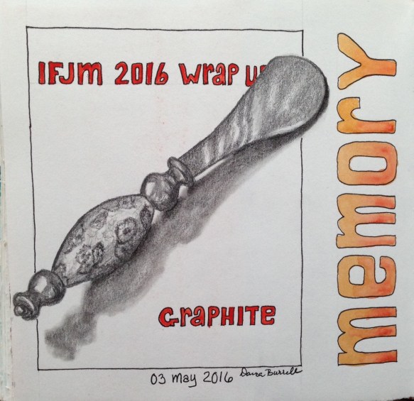
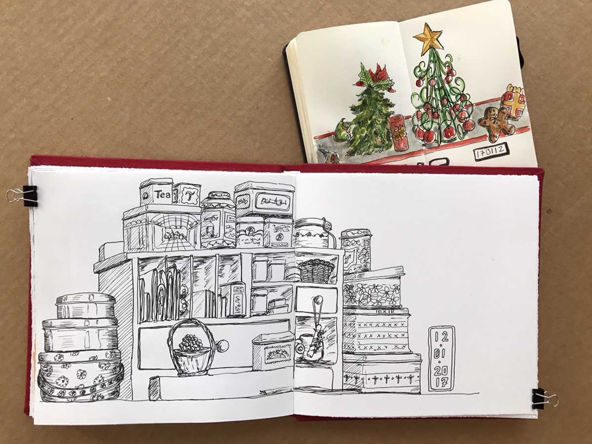
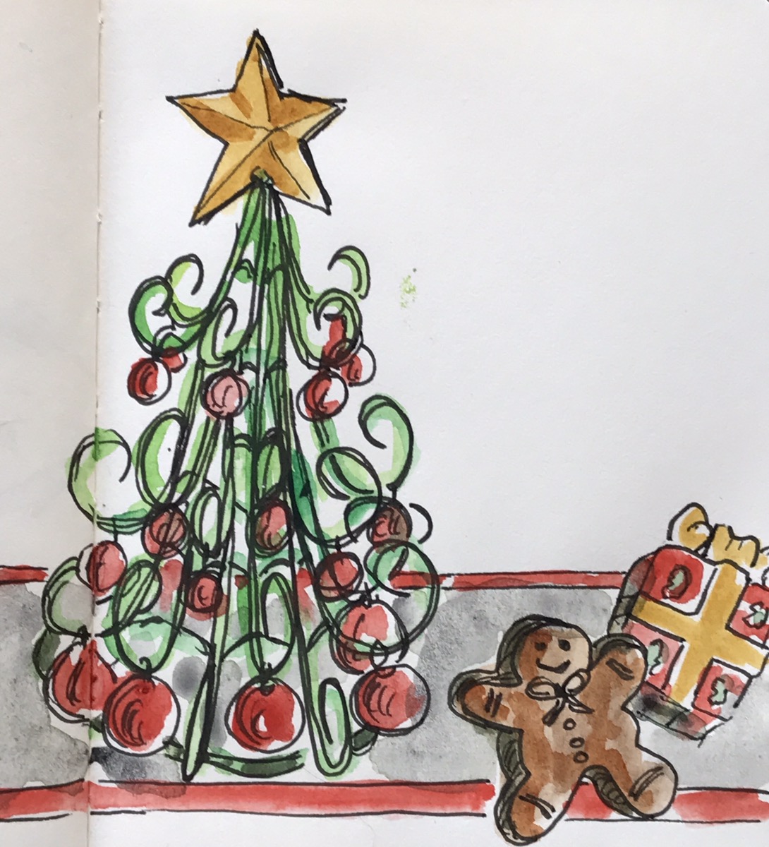
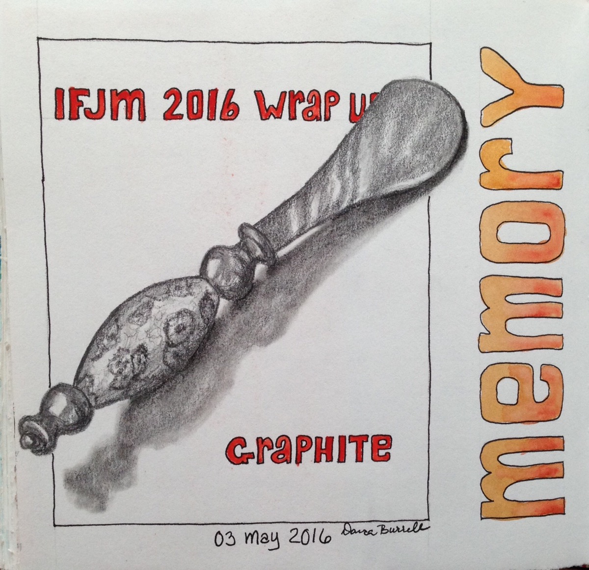
May: Kept a separate journal for my IFJM work – International Fake Journal Month, but wrote my wrap up in this journal.

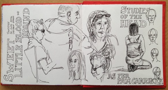
June: Summer outdoor concert series has begun.  Great people sketching opportunities.

July: Sketched all morning and was on my way home when I saw the pond full of waterlilies.  I could have continued but the moment called to me… I stopped.

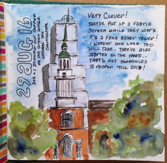
August: They were putting a new copper roof on the library. Documentation time.

September: Too many people in line to do more than put a few lines down on paper.  Finished from the greenhouse web cam… lucky there’s no such thing as smell-o-vision.

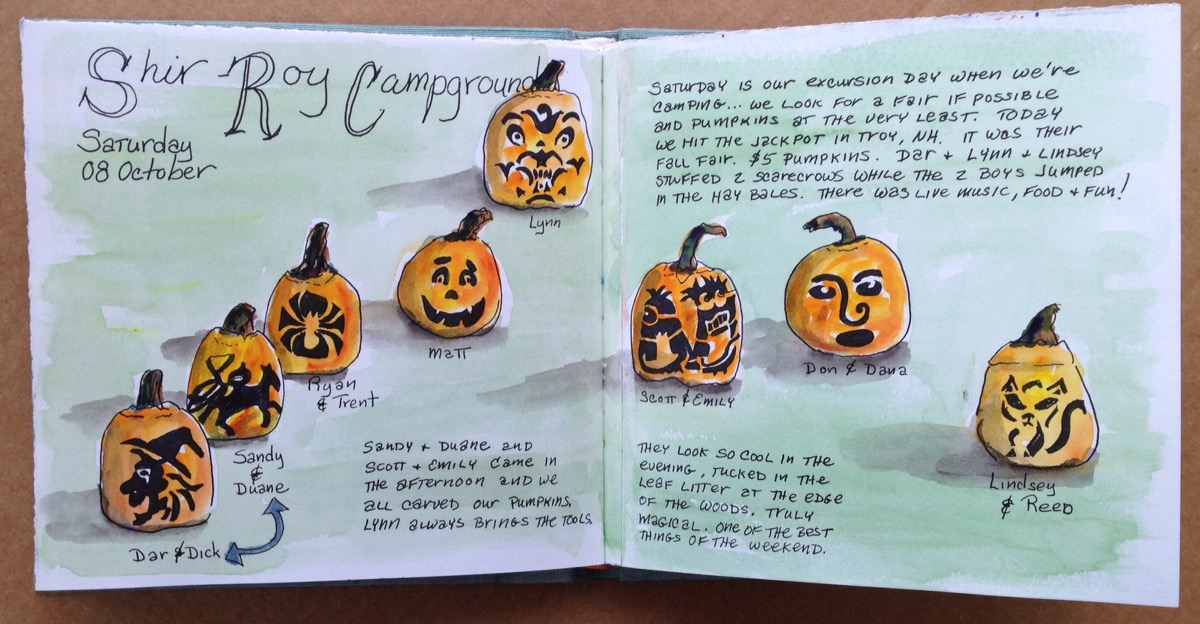
October: Not only InkTober but our annual camping with jack-o-lantern carving.

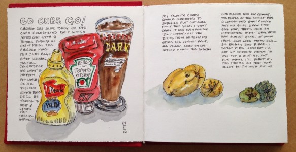
November: Daily documentation. Cubs World Series and autumn clean up.

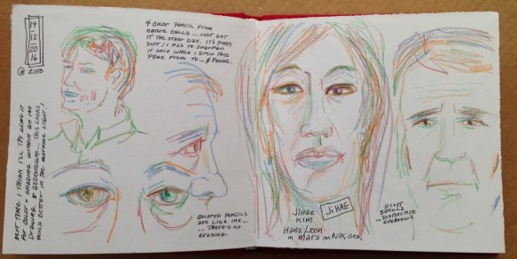
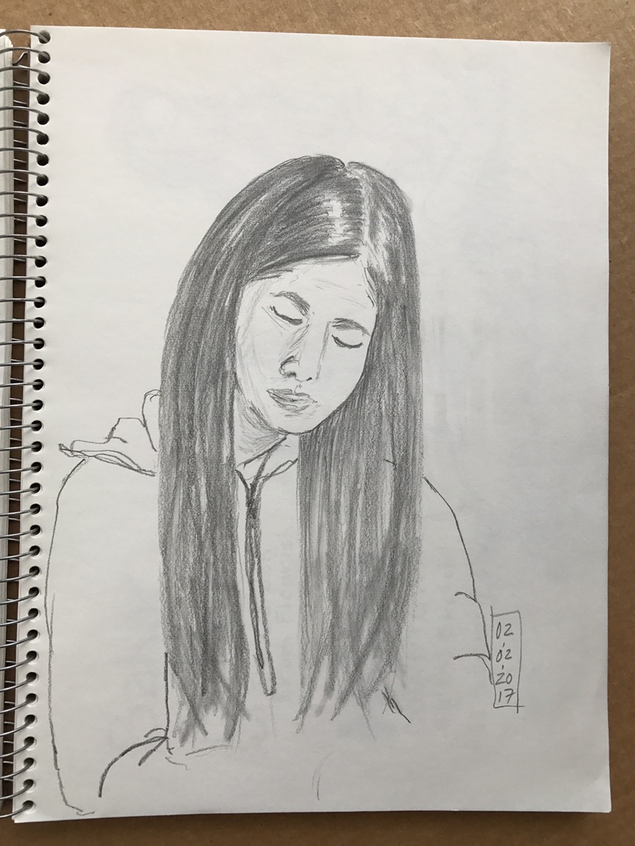
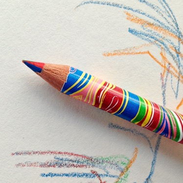
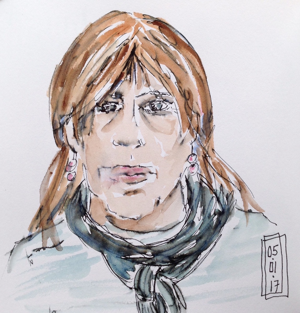
December: Portrait practice from TV as I toy with a kid’s four-color pencil.

On to 2017… Happy New Year my friends!

Addendum: Check out Roz Stendahl of Roz Wound Up for another great year-end wrap up.

Seeing Double

So what’s a double fold out called?

A gatefold. 

It’s when both the right and the left pages fold out and you feel as if you’re going through the gate to the scene beyond. That’s what I wanted to achieve here, but first I needed to deal with the closed spread. 

When all other ideas elude me, I paint my favorite models… pears. 


I love how the plate and shadow bleeds off the spread and how the border stripe echoes the pears’ coloration. 

But now it was time to tackle the fully open spread. When totally opened it measured 32 inches across, so wide that it was too daunting for me to just simply dive in. I took out my gridded notebook for some planning, and of course, more thumbnails. 


I didn’t use any of these designs but you can see how I calculated the best focal points using the rule of thirds. 

I mined one of my previous sketchbooks for a suitable landscape and as I painted I placed the skyline to blend with the edge of the plate. I may have been overthinking it but it turned out well. 


32 inches of panorama. 


Now that it’s done I’ve thought of a few other ways to handle a gatefold. Maybe next time I’ll handle each of the 4 panels separately, but unified by a single theme, like the seasons. Maybe I’ll draw a progression across the spread, like how a rose bud opens, blooms and finally withers. 

So many options for me to try next, I know there’s more sketchbook modifying in my near future. 

Autumn Leaves Fold Out

As I continued to work through my latest sketchbook I came upon another one of the fold out pages. I had pasted a few extra fold out pages into my sketchbook never realizing the extent of the design challenge I’d have.

This time I had no idea what to do. Days went by, then weeks. Finally I sat down and drew out a few of my ideas. This is the design I decided to use drawn to scale in a squared Moleskine notebook. 


The very act of drawing the thumbnail design fueled my desire to finally deal with the spread. 

I drew a few maple leaves, painted the background and cut out a circle instead of cutting around the spiky bits of the leaves as I had originally planned. It’s good to reconsider a questionable plan instead of slavishly following a design that could easily fail. 


Time to paint those leaves… look! I added a leaf in the cut-out!

When the left page is folded out the lyrics to one of my favorite jazz standards, “Autumn Leaves”, are revealed.

If I hadn’t taken a few minutes to draw out some of my ideas I would still be looking at these pages wondering what to do. 

Thumbnail sketches to the rescue!