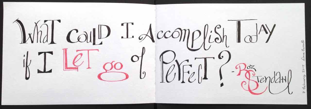
Pens! So many brands, nibs and colors… so little money. sigh.
Pilot Metropolitan to the rescue! They’re only $15 and they come with a squeeze converter and a cartridge. Even if you add a different converter of $5 it’s still a great bargain! I’m in love with the Fine nib.

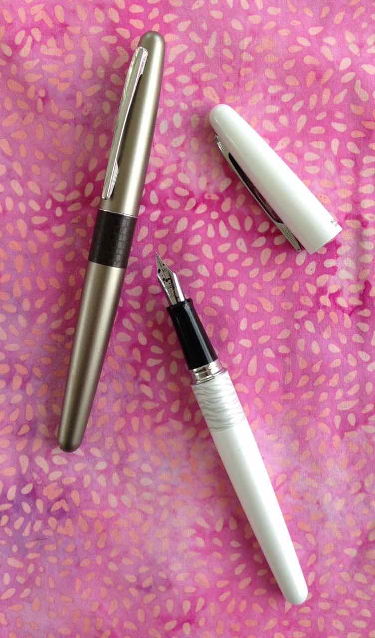
I think I need that purple one next!